Apple Event October 30, 2018 - Major Themes
Watch video of this blogpost below, or audio on your podcast app under: Gregory Schmidt
Apple held an Apple Event Oct 30 2018. Let’s look at a few aspects of it.
1. Major themes
Last month I wrote a long post of why the September September 12 2018 Apple Event was horrible.
Yesterday’s event fortunately made none of the September blunders. It was a smooth running, highly polished show that did a good job raising excitement over some product upgrades that people had been looking forward to.
1.1 Some numbers
Apple sold more iPads last year than all the combined total of all notebooks from all other companies.
1.2 Apple Retail
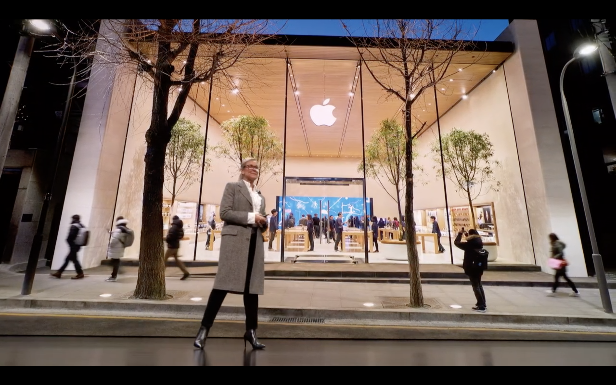
Apple’s store has become a feature now in all their Apple Events. Angela Ahrendts (SVP of Retail) described retail to Apple as, “their largest product…we think about the architecture as our hardware…and the experience inside like our software”.
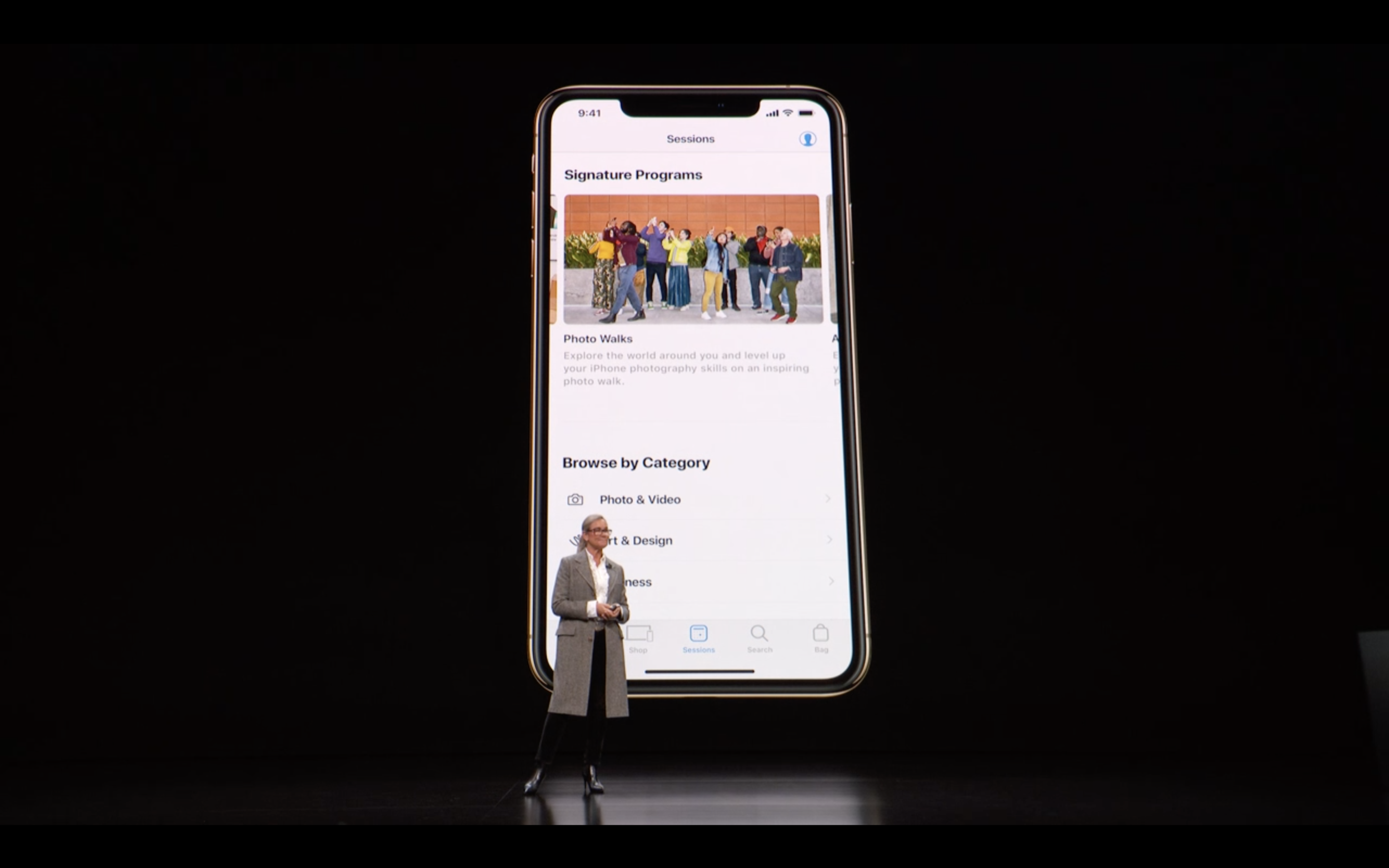
Today at Apple
A year ago Apple launched a new in-store educational training school for the public. It is offered at all 505 Apple store locations by their 70,000 team members. 18,000 educational sessions are held per week. The stores act as global platforms for local artists.
This is all part of the goal to transform the Apple Store from being retail experience, to cultural icon and gathering places. I think this strategy will pay off and is 100% the right path forward.
Demo’d were screenshots of the Today at Apple part of the Apple App. It can target customers based on events near them in the city, or based on products they own. I’m curious to see where Apple Retail goes next.
1.3 Strong Asian Theme
Many of the Apple retail stores shown are opening in Asian cities.
The keynote also opened with statistics about 50%TK of Mac buyers are new to Mac, and that 76% of these new customers are coming from China.
1.4 Recycling
Last Keynote announced the move to using 100% recycled Tin in its manufacturing.
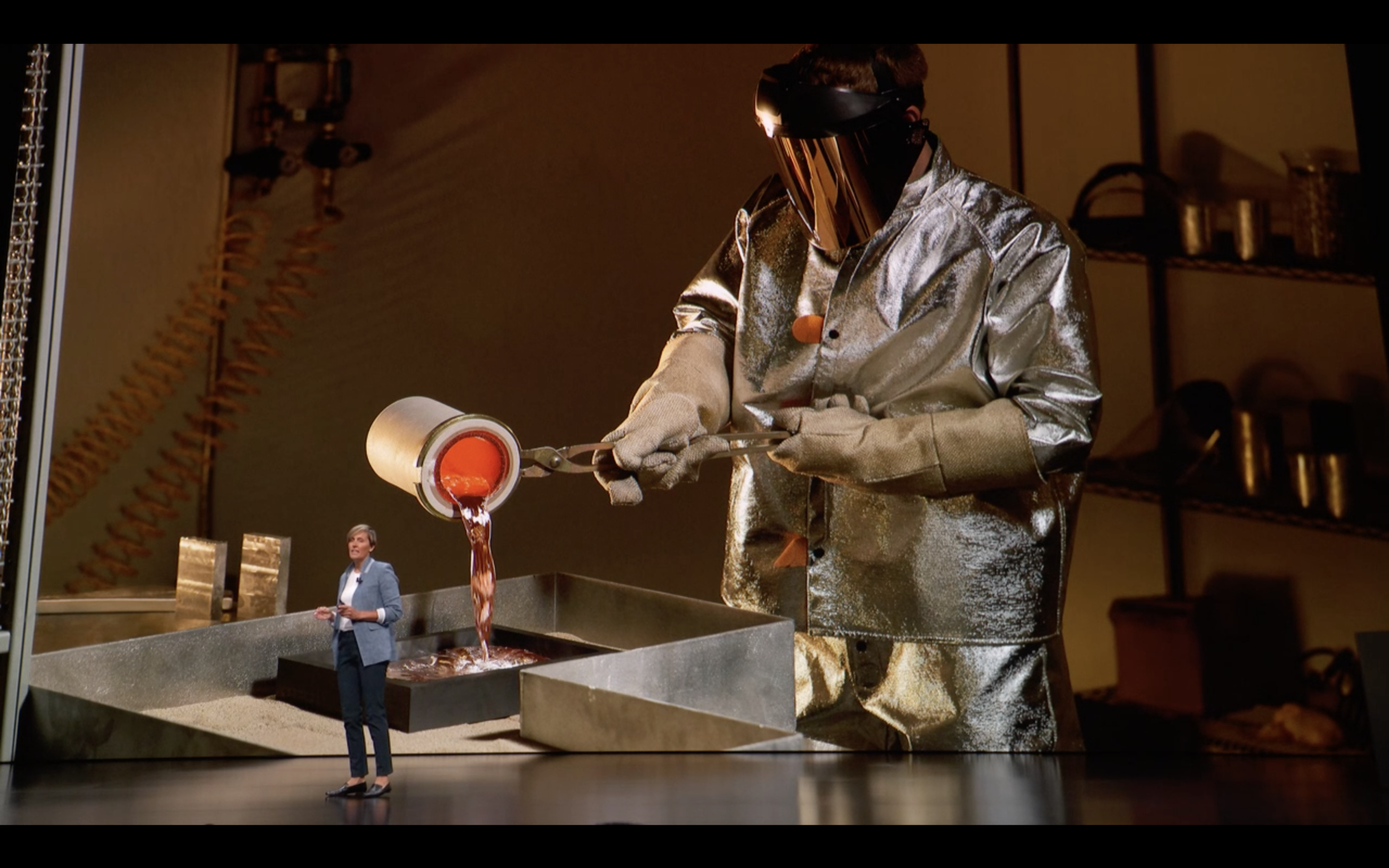
This time Apple reveals a new alloy that is able to use 100% recycled aluminium. This will be used to start in the new MacBook Air and Mac mini.
This is nice for the environment, and I suspect even nicer for the cost of that part of Apple’s supply chain.
1.5 Order today. Available next week.
It is really powerful to be able to keep something relatively secrete, and then release it available for sale the next week. The Apple supply chain is kind of amazing.
2. New Products
2.1 MacBook Air
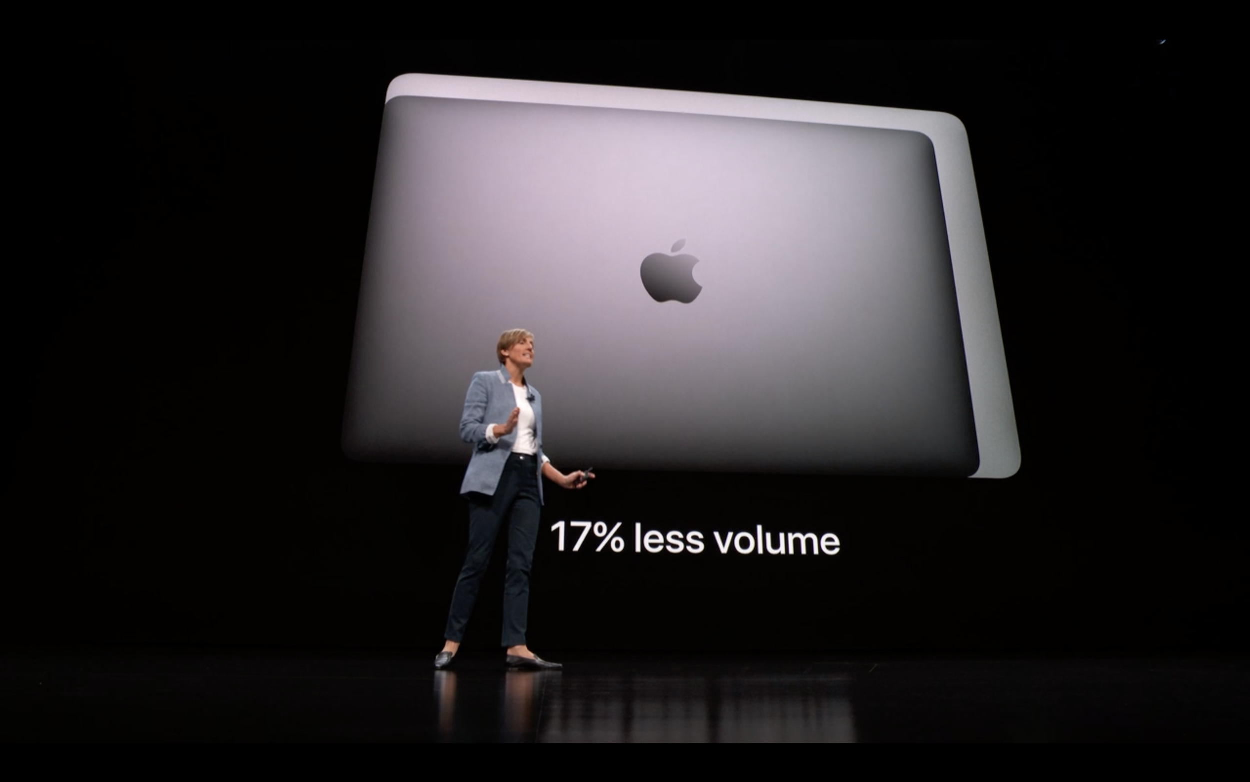
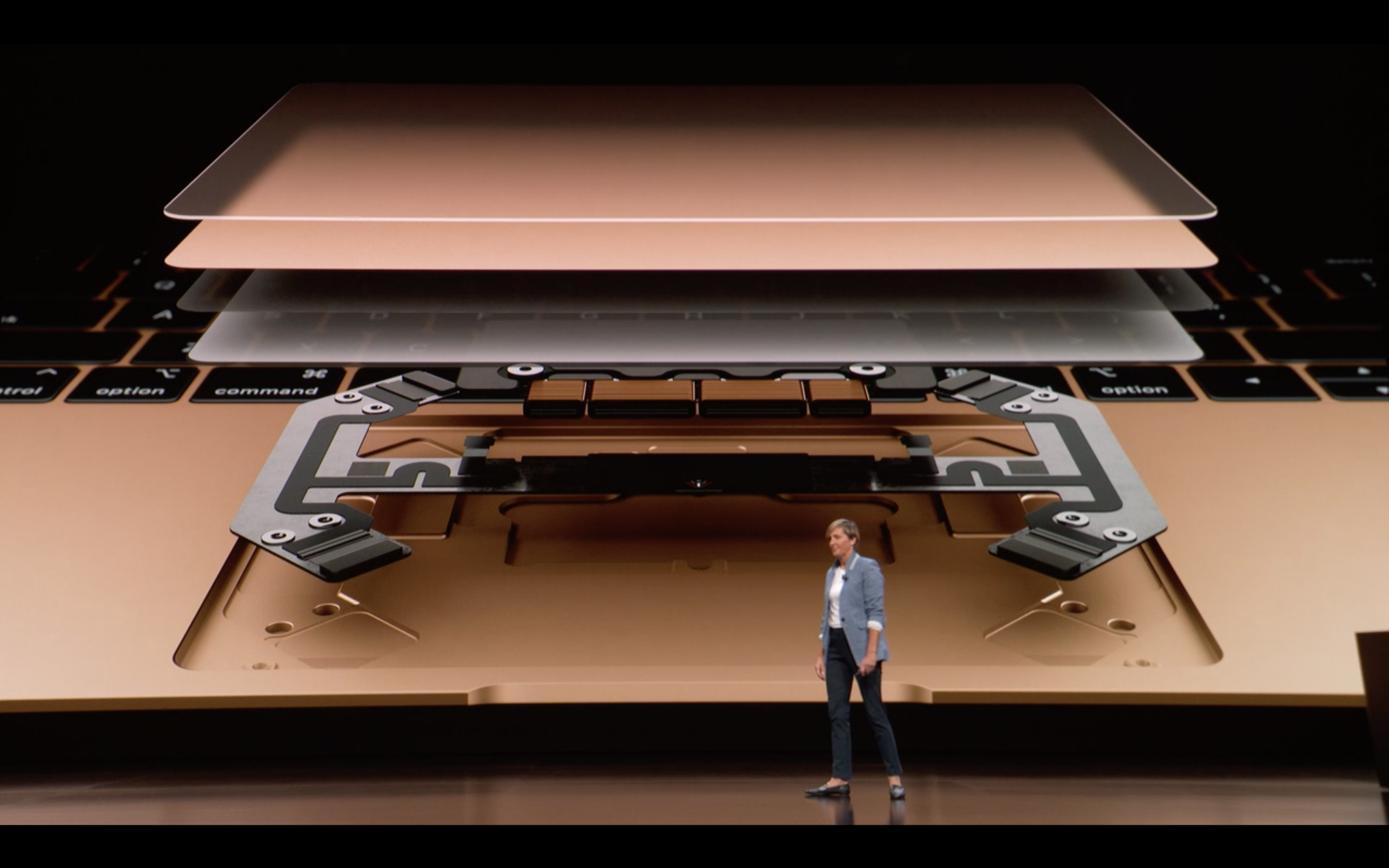
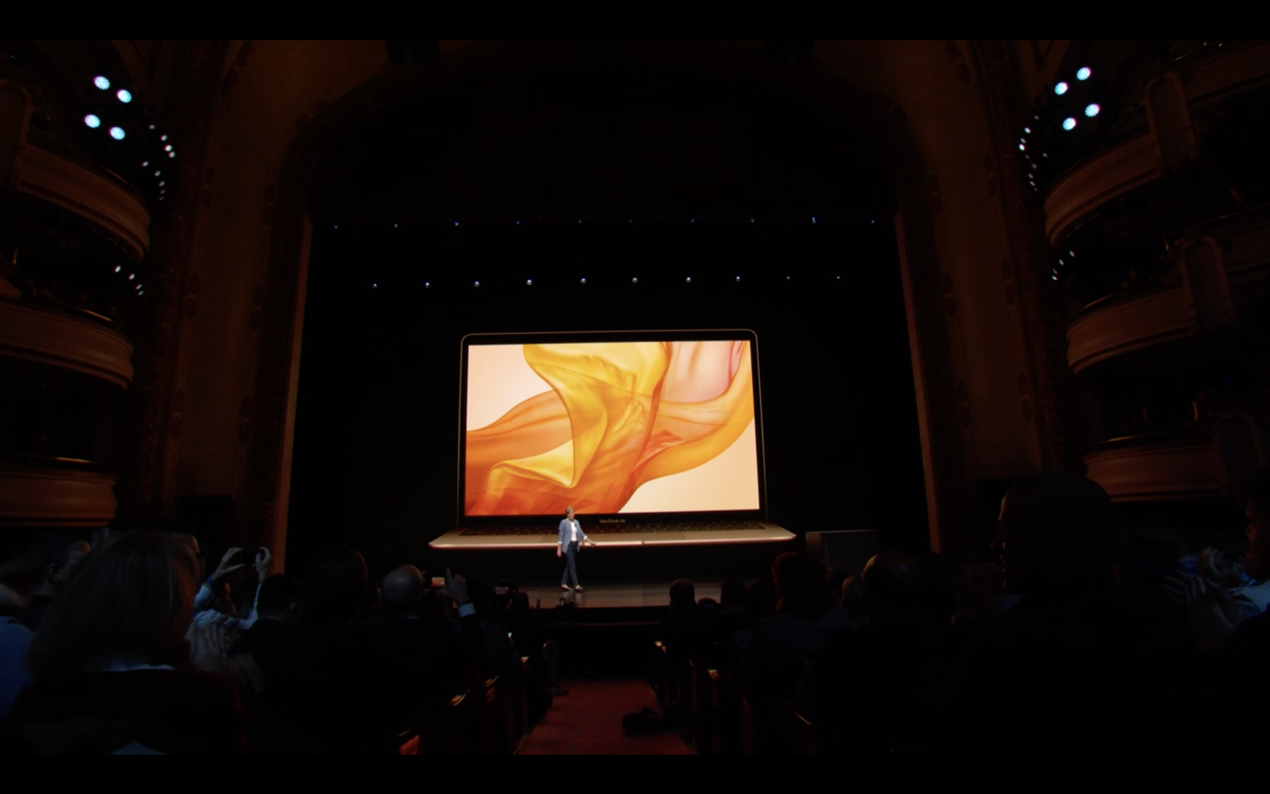
New MacBook Air. Has retina display. TouchID. New T2 Security Chip (which is awesome btw). Expandable up to 16GB ram, 1.5TB SSD. Battery same 12-13 hr. 17% less volume. 10% thinner. Quarter pound lighter (2.75lb).
2.2 Mac Mini
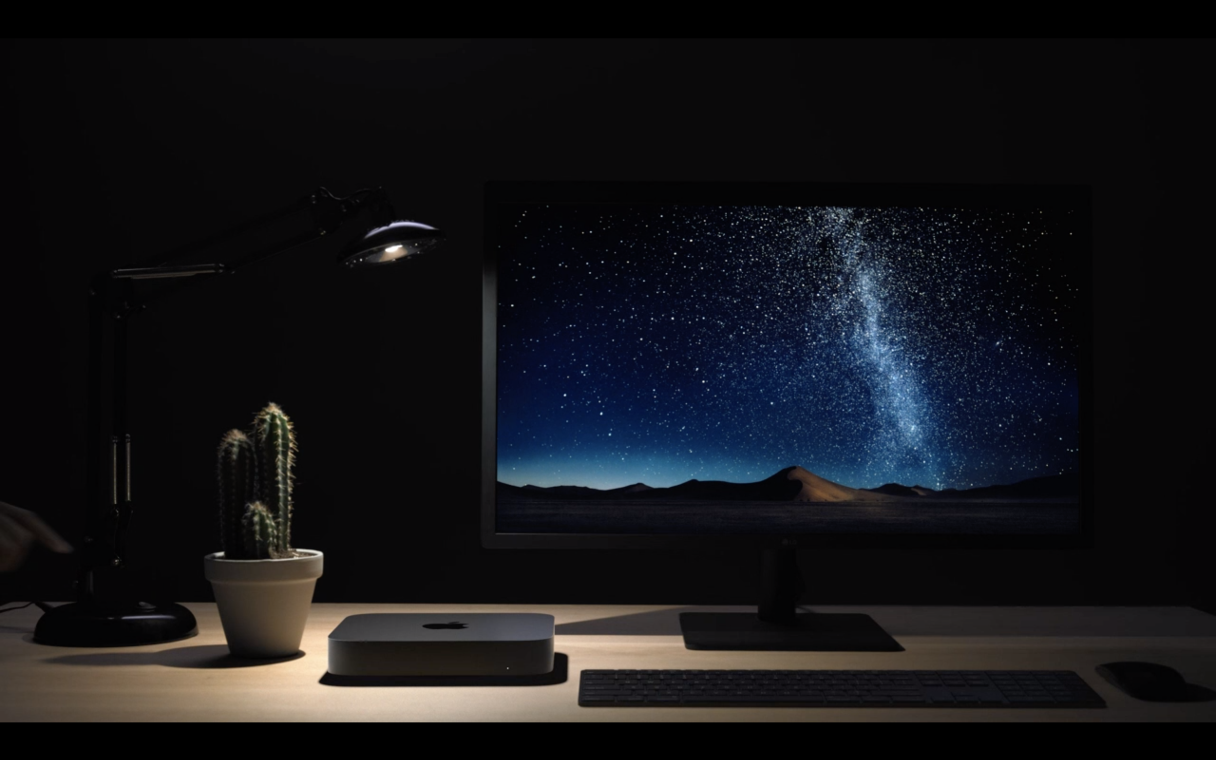
The “small but mighty Mac our users have been waiting for”.
The new release is 5x faster than before, and encodes HEVC video 30x faster. Upgradable to 64gb memory, 2 TB SSD, Apple T2 processor.
The mini’s can be strung together, or attached to a laptop to add more horsepower.
Lots of presentation shown how MacMini’s can be used in various studio, movie, music, machine learning environments.
Initially I thought they were joking when they showed a server room full of minis daisy chained together. Turns out MacStadium is a real company, with almost 8000 of these.
2.3 New iPad Pro is damn powerful
The iPad Pro intro video did a very clever transition showing the move from the old Pro to the new.
[VIDEO]
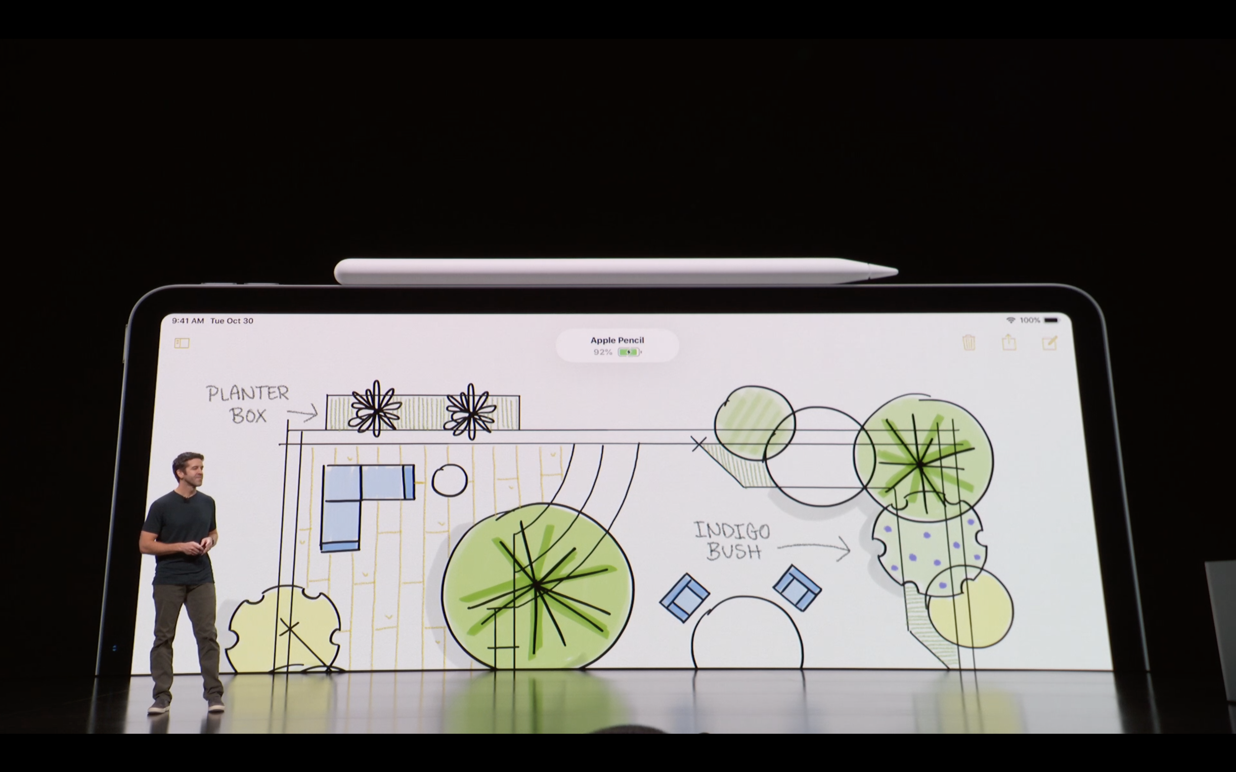
New iPad Pros release with larger screen, thinner case, FaceID, and an Apple Pencil that clips to the exterior of iPad to charge. (Charging the Pencil wirelessly means that it always is ready to go when it is needed, which is a nice UX consideration).
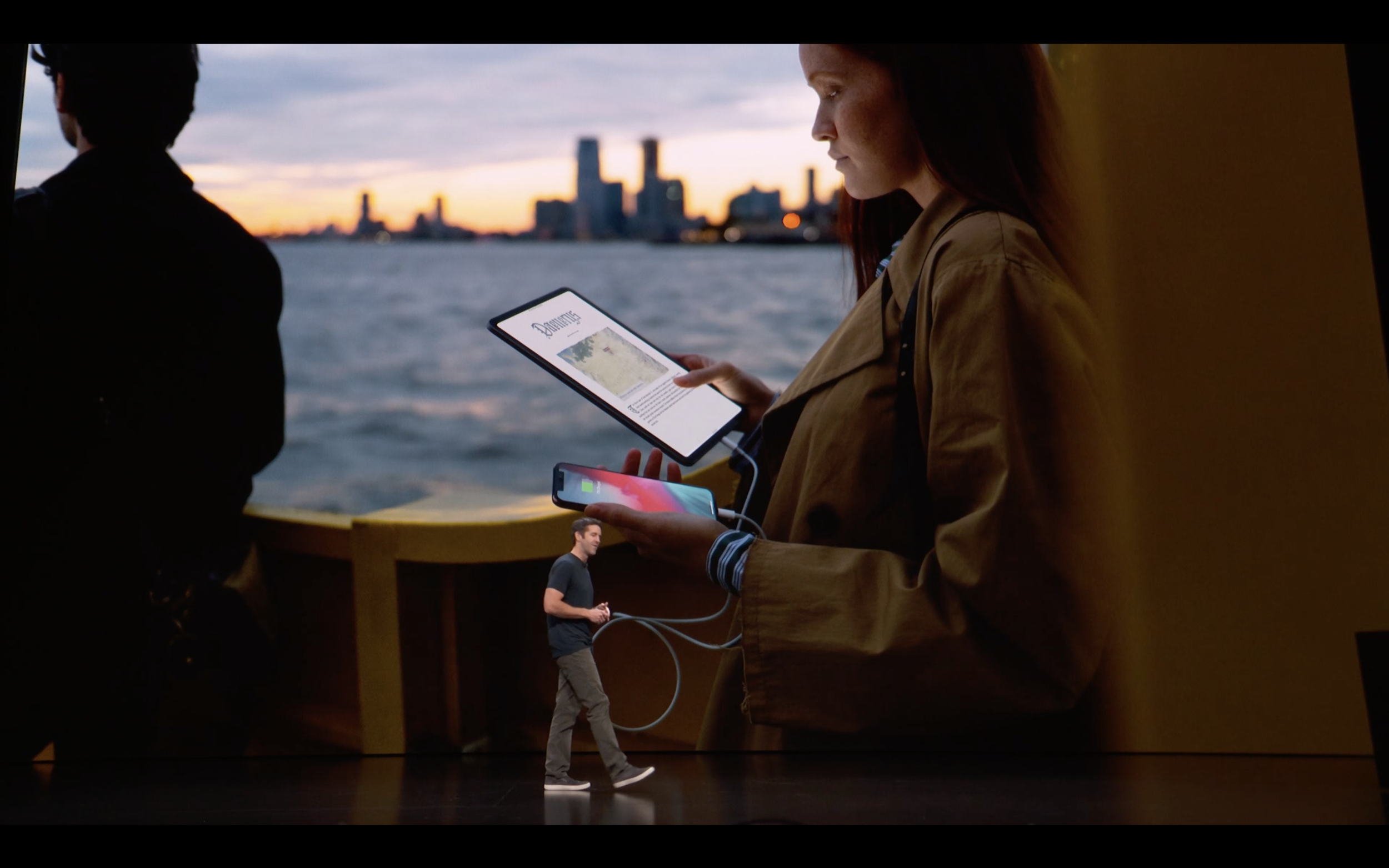
New iPad supports ‘charging out’ via USB-C, meaning the iPad can charge the iPhone.
Neural Engine also added for improved ML.
The big take away was the faster processor. It is 1000x faster graphics card than the first iPad.
The new tablet is also 92% faster of all other portable PCs. Which is kind of crazy.
Several comparisons were made through the presentation to how the iPad performed against a gaming console. The iPad also exports to a 5K screen via USB-C making a big screen experience possible. Clearly that market is coming directly into their sights.
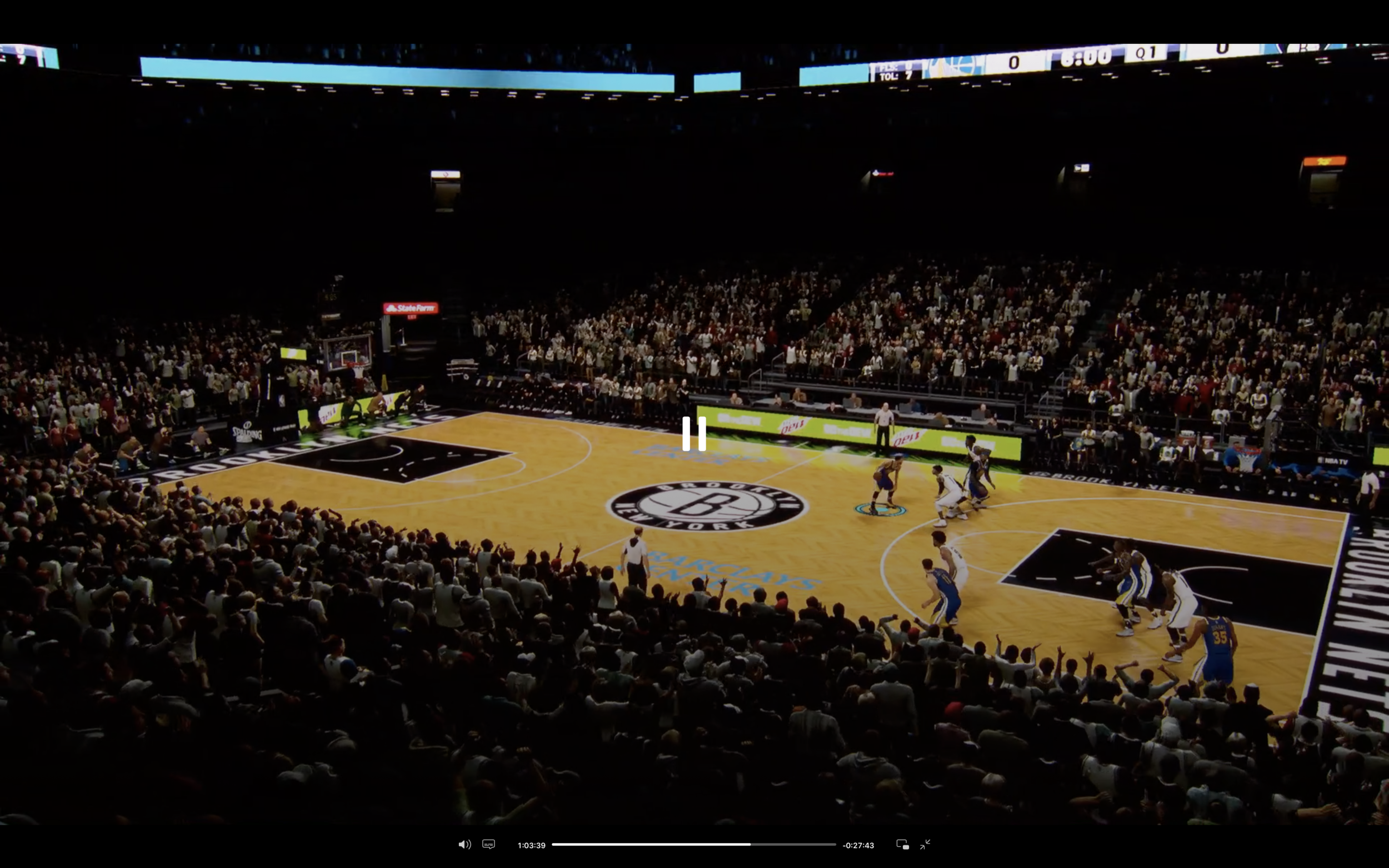
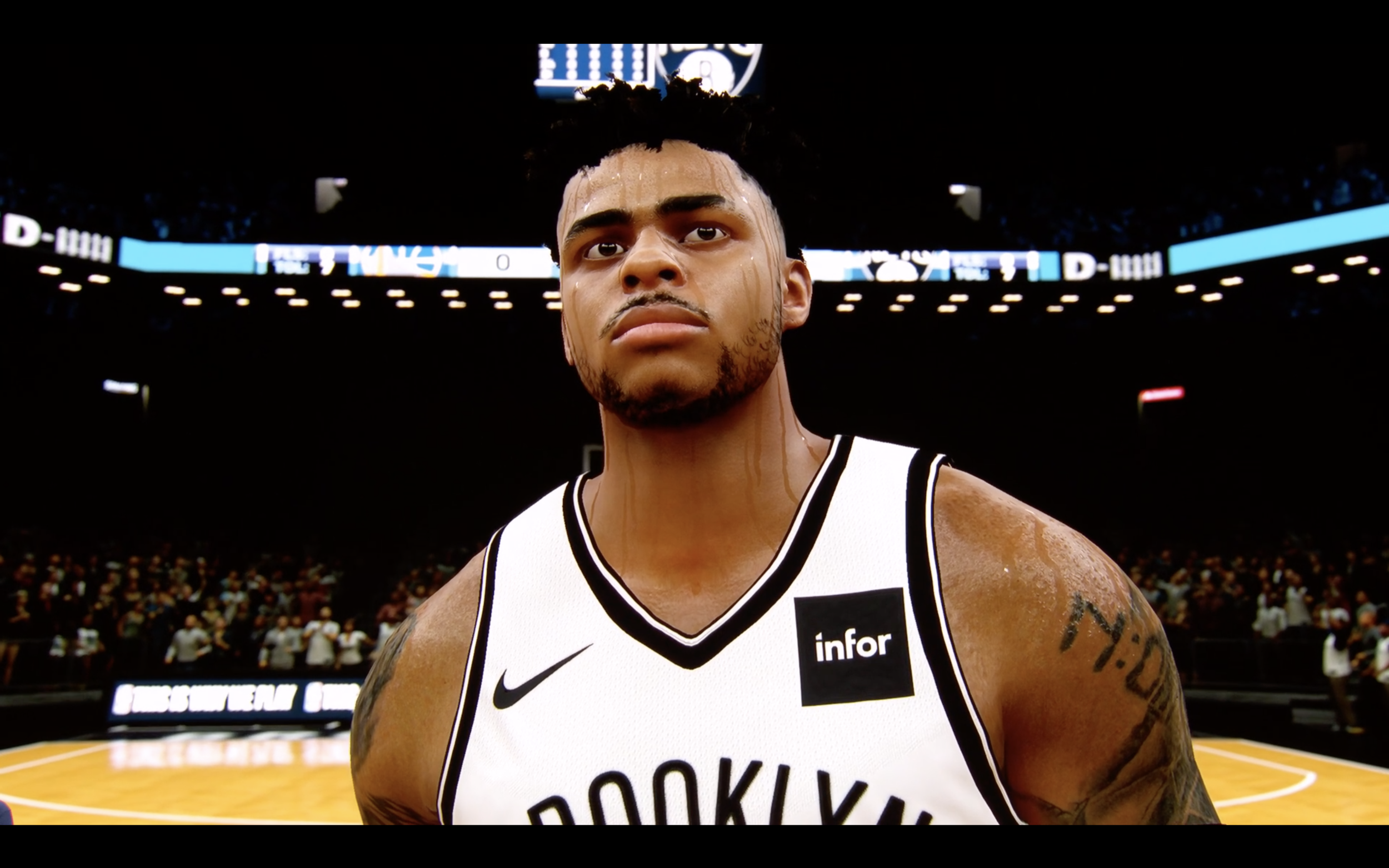
Comparison was made on how much smaller the iPad is, and how it’s performance matches that of a console. Except, it can render at 120 frames per second - making it faster than a console. 2K Games have a very impressive demo of NBA 2K19 rendering over 6 million pixels at full retina resolution.
Auto-Desk was rendered on the iPad.
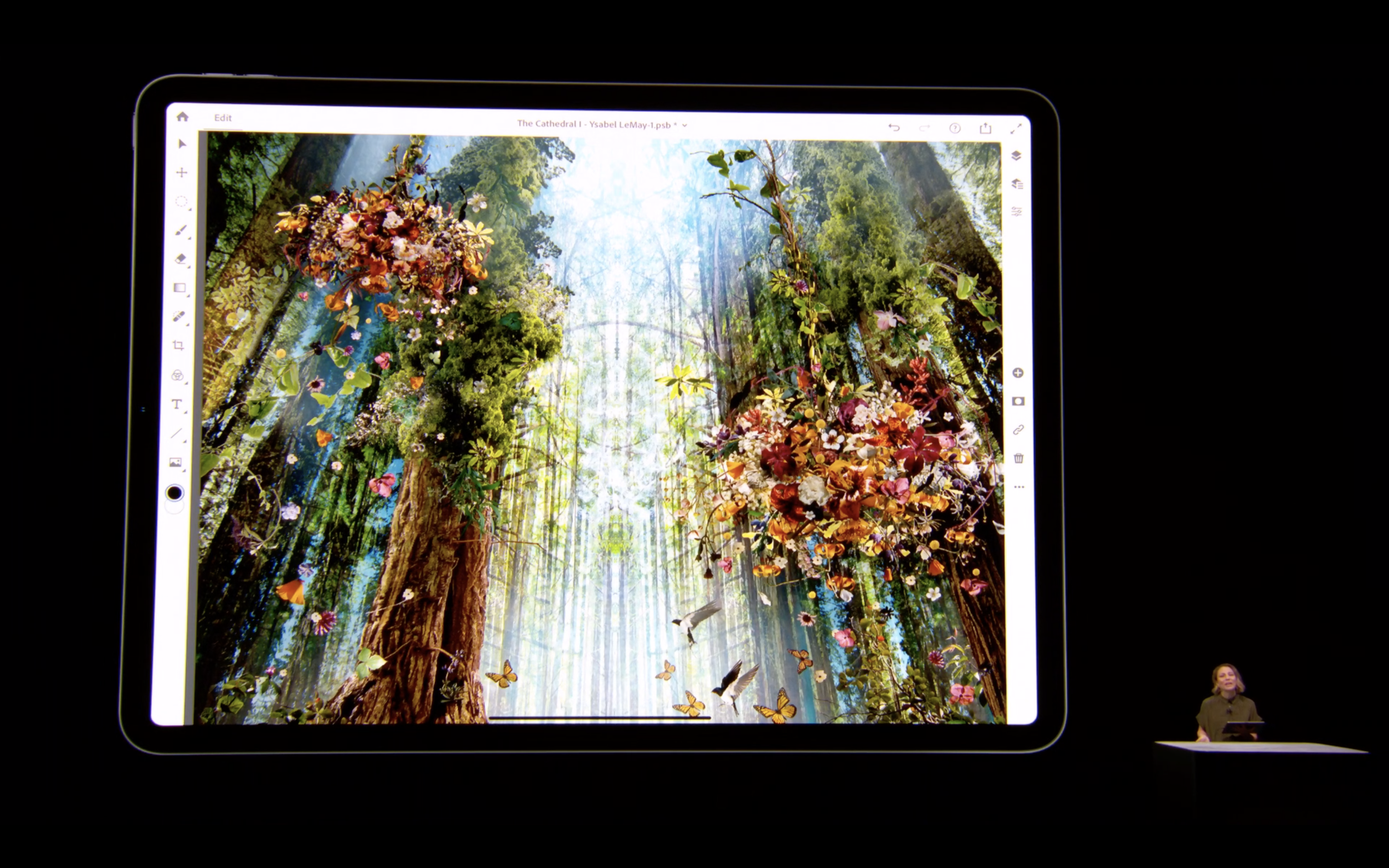
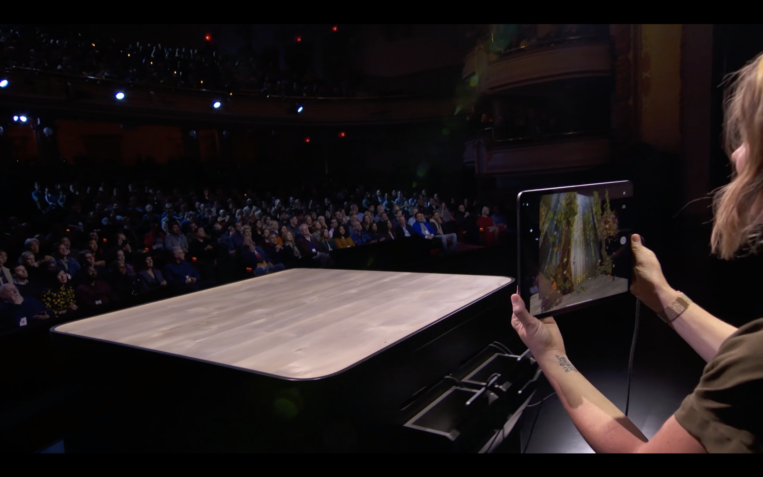
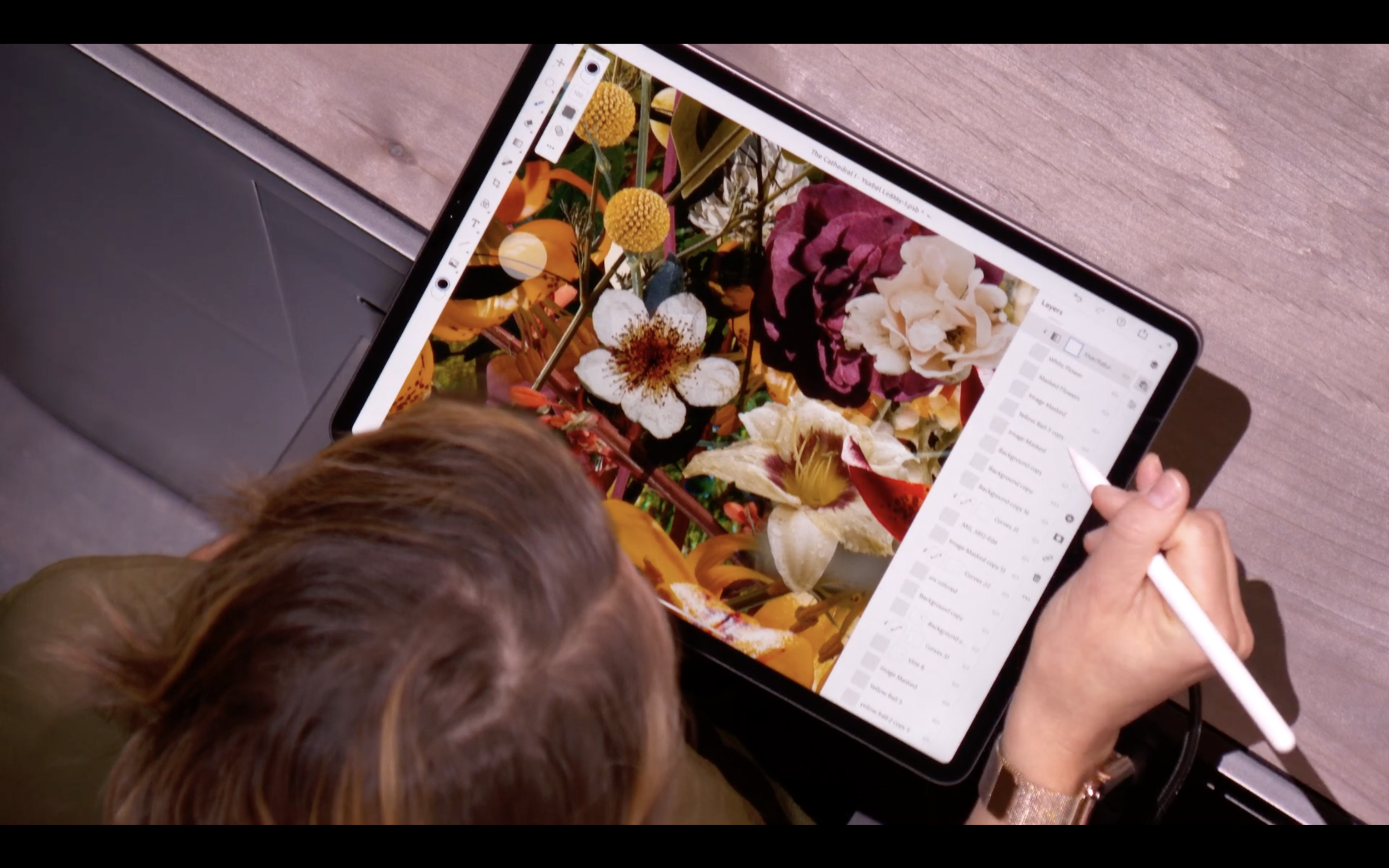
Adobe Photoshop gave a killer presentation. The presenter was very very good.
The new Photoshop for iPad Pro look beautiful. It is also functional, using the full photoshop engine. In the demo it rendered a 3 GB Photoshop file (output 9x9 feet image) with 157 layers effortlessly. There was absolutely no lag. It really is a game changer.'
A good UX feature in photoshop is the addition of a “touch modifier” as part of their contextual UI. When someone places their thumb inside the circle seen on the far left side of the screen, it changes the functionality of the tool.
3. The Presentation
Last month I wrote a long litany of how horrible the Apple September 12 2018 event was.
The presentations were poorly written, boring, heavy on the tech specks, excessive on the hyperbole, and overall presented without any authenticity.
My brother texted me the day before this Oct 30 event wondering, “if they fired their last presentation prep team”.
I don’t know if they did, but this Apple Event was pretty smooth from a presentation perspective.
Authentic Scripts
The script was good, and in particular the best part of it was that it matched the speech style of each presenter. This is so crucial to being able to deliver an authentic presentation.
Special credit this time to: Tom Berger (Head of Mac Product Marketing) for giving a keynote in his own style. And as mentioned, the presentation by Chantel Benson from Adobe was that of a natural presenter. Per usual, Angela & Tim did a polished job.
An example where the script didn’t work was the MacBook Air product video. The script sounded 100% exactly like something that was written for Johnny Ive. But instead, it was read by Laura Metz. All I could think of when watching the video was, “this isn’t Johnny’s voice”.
If the goal was to insert a new voice into a product video, the script needs to be designed for the new speaker. This is particularly important if the speaker will be filling a role previously held by a distinctive and longstanding voice such as Johnny Ive.
For instance - the iPad Pro introduction video (unsure who narrated that one) has an entirely unique voice to the script [see 3min video above].
Listen for yourself:
Presentations
A critic last presentation was that the product demonstrations were horrible.
In September many demos started with boring descriptions of the tech specs. Fortunately this was done away with. Apple returned to using intro videos that either showed the product, or (better) showing how people’s lives were better because of the product.
In September also when the product was seen on screen, it was often static images. Fortunately these were replaced this time with good quality videos demonstrating people using the product.
Slide Font Screw Up
My brother pointed out that the slides use an italics scribbly font that is hard to read.
Turns out the iPad team used a different front that is indeed hard to read for the technical specs on screen. (I get it - I suspect they wanted to create the illusion of a ‘hand written’ script to go with the iPad and Pencil. Meh.)
Compare the slide below of the iPad, to the much easier to read font that was used on the MacBook Air presentation.
Hard to read scrawl.
Much easier to read font
New UX: Swipe between Apps
The user can now swipe the bottom of the screen to move between apps.
I’ll have to see how this works in practice. I think this may have been a bad decision. It limits the lower screen functionality within an app (harder to put a swipe feature here).
This was also not a problem before. I have four finger swipe between app enabled on the iPad and it works great to move between screens.
…will have to try it in person.
Start
Event started pretty much exactly on time. Pre-show music by Leon Bridges - If It Feels Good (Then It Must Be).
The event was held at the Brooklyn Academy of Music. This is a big venue and holds 2000. When Tim Cook walked on stage he seemed a bit shocked at how loud, and energized this New York crowd was. (I suspect quite a number were Apple store employees.)


