Apple Event September 12, 2018 - Major Themes
Don’t want to read, watch video summary below, or search your podcast app for: Gregory Schmidt
Apple’s September 2018 Event finished yesterday. It was remarkable, for perhaps being one of the worst Apple Keynotes in the last decade. The iPhone price keeps escalating. The presenters were poorly coached. Many of the improvements seemed incremental, rather than a significant leap forward or presentation of conceived technology.
On the good side - Apple Watch now has a built in EKG, and moves closer to becoming an “intelligent guardian for your health”.
If you believe I am incapable of writing any critical articles about Apple - then please skip this article - and instead read my exceedingly favourable article about the Apple June 2018 WWDC 19 Keynote.
After writing this article I wanted to see if I was off base in my criticism (second half of article). Appears I am not alone. Dave Smith wrote in Business Insider: “I've been watching Apple events as part of my job for almost a decade. And Wednesday's event in Cupertino…has to be one of the more disappointing Apple events in recent memory.”
1. The Good
The webcast lead-in song was Jungle’s new ‘Heavy, California’. Great band. Great new hit. No surprise here: Apple always knocks it out of the park with music selection.
The intro movie was some sorta chase scene through the new campus. It was a good excuse to show off they’re new sweet building by the ineffable Foster & Partner’s. Even the radius-curves on the paths are perfect.
The Keynote started discussing the Apple Stores. The priority to make these Apple stores community gathering places has been emphasized in past Keynotes. It seems to be working, they have over 500 million visitors a year.
1a. Apple Watch
Apple Watch - General Upgrades
The watch is the current darling child of Apple. For good reason. It created a new category that previously was just occupied by small startups and hobbyists. Apple Watch is the best selling fitness watch. It is also the best selling watch in the world.
The watch is also particularly exciting as it is easy to imagine a product release cadence over the coming years of new features, in particular in the area of health and monitoring of baseline physiology. This is something we have never had in medicine before. The device also is the first major category of ‘worn’ electronics. (Google Glass was too unsuccessful to count). Which is a space that will continue to expand.
The major upgrade is a slightly larger watch face with a thinner case. This may not seem like a major breakthrough, but I do think the screen real estate will be significantly noticeable when worn. The side profile and and rounded edges of the thinner are really beautiful.
The digital crown has also been re-worked to include a tactile feedback. This will improve precision during its use. You will be able to feel each album as you flip through them with the crown.
Apple Watch - Health
Ever since the watch was first released, we always knew the plan is to turn it into a health monitoring device. Tim Cook for several years ago would use the analogy to monitoring a a car, and the value of the ‘check engine’ light to the driver. Similarly, Apple could help develop a ‘check engine’ light for the human body.
The phrase repeated in this Keynote: “Apple watch has become an intelligent guardian for your health”.
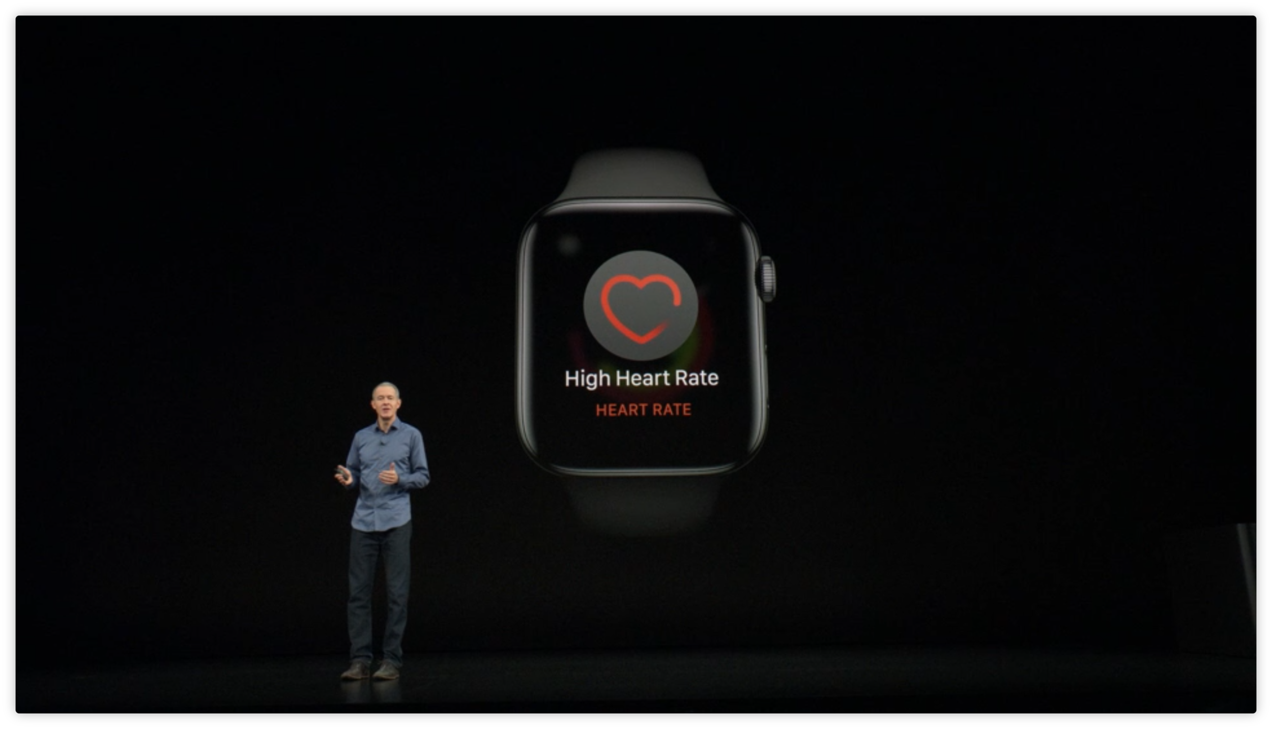
Apple is slowly approaching this goal. Last year the watch started alerting users if they’re heart rate was excessively high for the situation - a suggestion they may have underling atrial fibrillation. This year there were three major improvements
a) Improvements to the accelerometer and gyroscope: Why is this important? The watch can finally be used as a ‘fall alert’ device. When connected to cellular/the phone, the watch can send an emergency alert to EMS & to one’s emergency contact list.
There are fall alert bracelets and necklaces on the market. But they are costly. Typically they required monthly contracts. Many of the one’s I’ve seen often require the user to press a button to activate them.
Fall alerts are of huge importance. As people age a major concern is having a fall in the home and having difficulty obtaining help. The piece of mind that if one falls help will arrive is an important step in ensuring people can age in place at home longer.
b) Apple claims to have add two new algorithms: First, A low heart rate sensor (will be curious to see how this doesn’t get set off accidentally). Second, the detection of atrial fibrillation via irregular heart rhythm on the optical sensor. (Again I want to see the first hand studies demonstrating this). Its not that I don’t believe it works, I’m just curious to know how well it works.
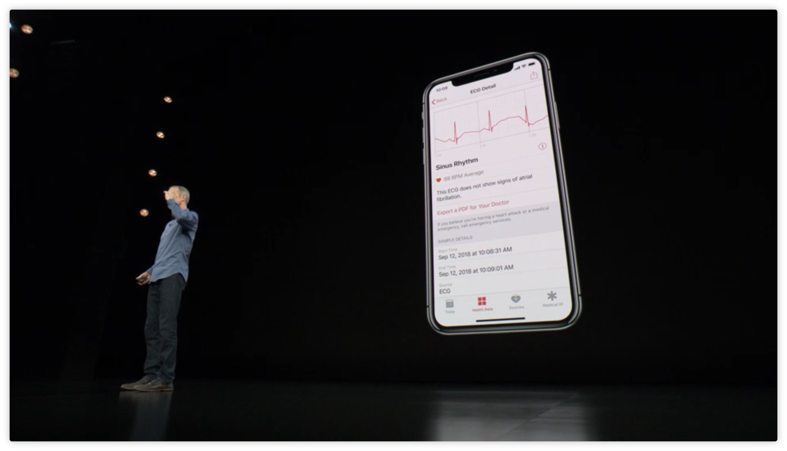
C) The major upgrade was the addition of an electrical heart sensor, which allows the recording of a single lead electrocardiogram. One lead is on the back of the watch and the circuit is completed by pressing the digital crown with the other hand.
Its cool piece of tech, and is exciting to finally be build directly into the watch. AliveCor several years ago created an innovative wireless single lead EKG sensor, and then came out with one integrated into the watch band. Moving it directly into the watch was the next step.
Apple claimed "this is the first ECG product offered over the counter to consumers”. That is not true. AliveCor has been sold direct to consumers for several years.
I do think it will save lives and improve care. But concerns should be addressed. In particular in light of the Theranos scandals. People want to know more about the FDA’s first De Novo Approval. The device and atrial fibrillation software has been classified a a Class II device. Its not clear from this the amount of testing the device has undergone. Users want to see the first hand study reports. Lets see them published.
1b. Augmented Reality
The iPhone AR Demos ended up being very good.
The Homecourt App which watches your basketball shot stance and success rate is very well crafted. Its a major improvement in sports vision assistive coaching technology. It requires no body markers, no sensors, no fancy camera setups, and no post video analysis.
My brother was rather please / and upset with this app demo - as he had drafts for pretty much the identical app on paper. Too slow. Maybe next time 🙂
Directive Games gave a really slick the person AR game experience. Those commenting on Twitter ‘didn’t have the words to describe what they just saw’. But it sure looked cool.
1c. iPhone Camera
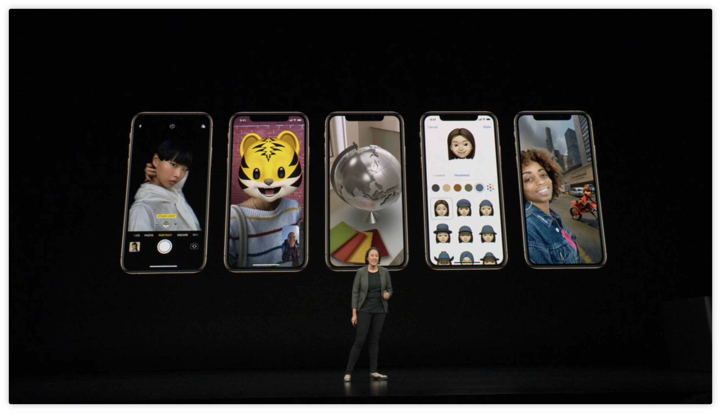
The iPhone Camera continues to push the bounds in this new era of Computational Photography. No longer does the person with the nicest camera glass win. Now it is a combination of optics, combined with the fast CPU chips and neural networks to do millions of processes to the photo instantly as taken.
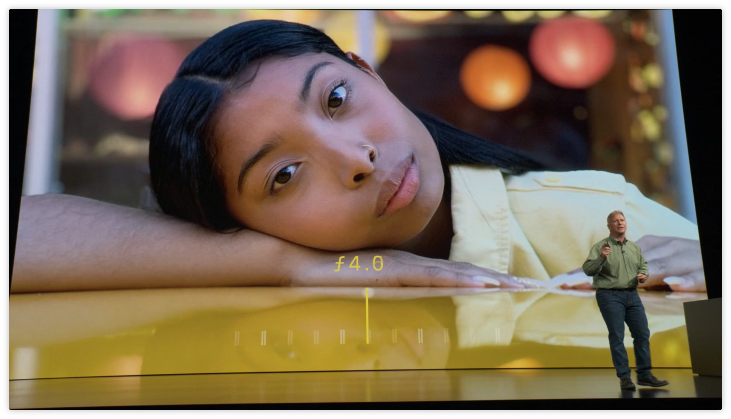
Subject isolation and separation (separating the person from the background) has improved significantly. The examples showing thin whips of hair perfectly separated from the background were compelling.
The major announcement was that now users can adjust the depth of field AFTER TAKING THE PHOTOGRAPHY. This is pretty crazy. It really does usher in a new era for photography.
The Bokeh created has also been improved and is impressive.
1d. iPhone Miscellaneous
Apple is increasing they’re use of recycled materials. Given how much mineral is mined for electronics this is good.
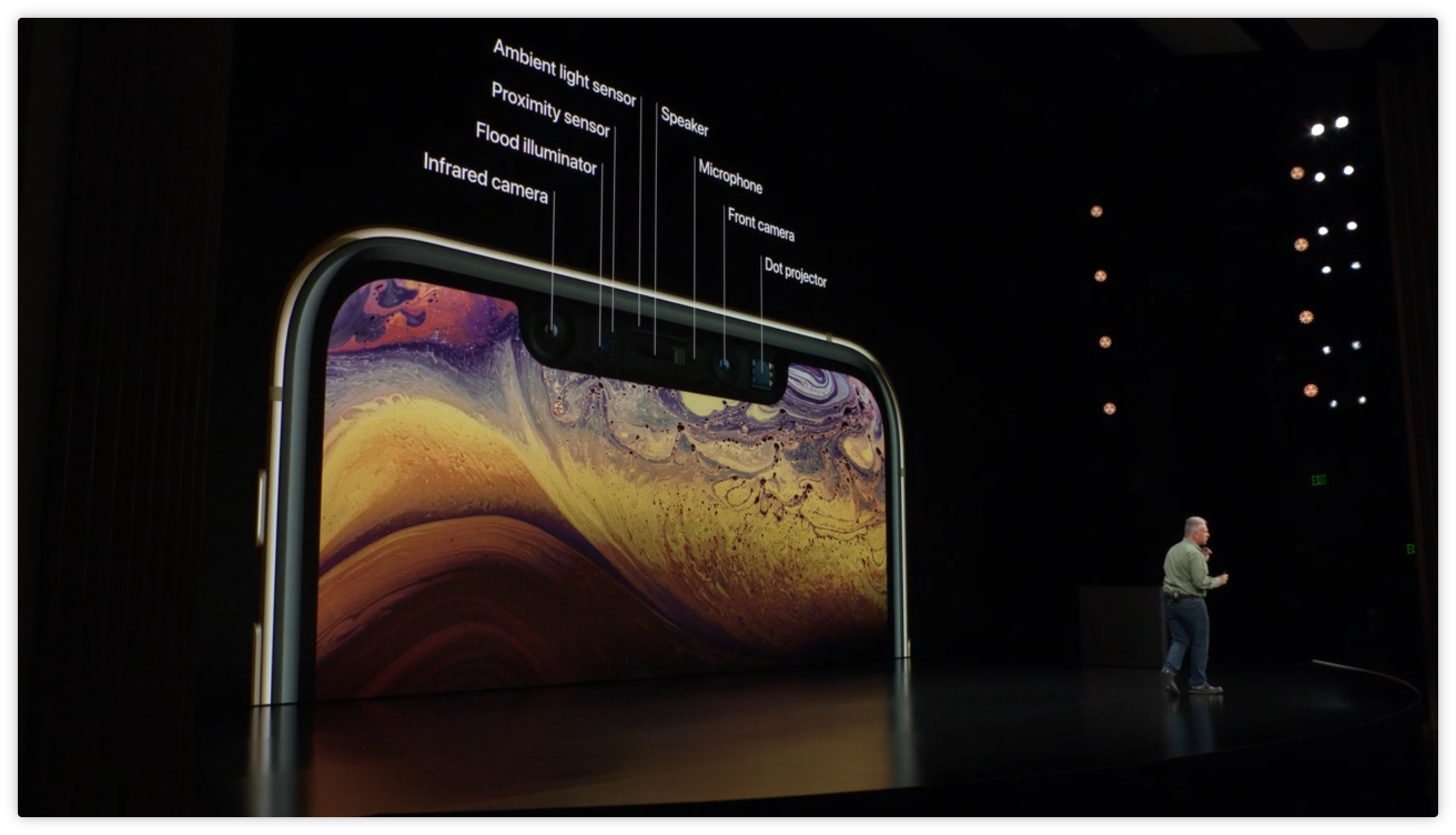
The new 6.5’’ screen in a device the same size as the existing plus, and the new 5.8’’ screen in a smaller device will certainly be a nice addition.
Dual SIM (or at least SIM + eSIM) is a good step forwar.
2. The Bad
2a. Absurd Pricing
After unveiling the new iPhone Xs and XsMax start at $999 and $1099 respectively, my brother and I were quite certain the iPhone XR would be listed at a much lower pice.
We even thought it may go low enough to compete with Samsung, Huawei, or Xiaomi. Fully aware - that Apple likely did not want to engage in a race to the bottom, we did think that providing a more affordable phone option would help them regain market share. And keeping people on the iOS ecosystem would have benefits of being able to have more profits from Apple Music, Apple App store, and potential future iPhone purchase.
Boy, were we wrong. The ‘cheaper’ XR model starts at $749. All these prices also are only for the base model - a tiny 64 GBs.
It seems the Apple strategy is to move even further up the high end mobile phone market, and leave behind the middle and lower price phones. A strategy I’m not entirely fond of, as I think increasing membership on the Apple ecosystem should be a high priority. Once someone leaves Apple to Android (and finds out Android works just fine for them) I suspect it will be more difficult for them to come back.
You may say - that it seem iPhones are getting more expensive. Correct. They sure are. The price has roughly tripled over the last few years.
This chart from Statista shows pricing the last 10 years (2007 - 2017).
Chart from Statista, 2017
We’d need to ask users if the perceived incremental benefit of the new phones are proportionate to the increased price. I suspect many would say not. Particularly when consider the incremental increases in speed that are expected annually with each phone, and the drop in smart phone prices by non Apple manufacturers.
2b. Boring Presentations.
Most of the iPhone presentation (especially the first part) was exceedingly poorly written. It breaks the rule of the pitch: “Show. Don’t tell”.
Instead, Apple spent considerable amount of time telling about various technical improvements to the phone. Describing its CPU, GPU, and Neural Engine architecture.
It would have been much better if the product demos came earlier. It also would have been more powerful to show how much faster the new chips can perform the same task compared to an older device.
Apple actually showed a picture of someone using an AR app. Rather than just showing the AR app itself. Ridiculous.
2c. Bad Presentations. Lack of authenticity.
A number of the speakers were really bad (for a Keynote of this caliber). The absence of authentic enthusiasm gave the appearance the speakers had been over rehearsed. It seemed they were repeating a script they have said many boring times before. A number of parts were actually painfully bad to watch.
A number of speakers, in addition to misspeaking, also spent a quite a lot of time looking at the speaker notes in the first row. Not at the audience. Rather than engaging an audience, many just read from a screen. First, you’d think a teleprompter would have been built into the back-wall of the theatre. Second, you’d think the stage coach would have emphasized being more authentic. Tim Cook did a good job, as well as Lisa Jackson deserves a special shout out for a great presentation. Jony Ive could narrate a commercial for a washing machine and everyone would want one.
2d. Enough with the Hyperbole
I suspect some of the bad presentations came not just from poor coaching, but also an inauthenticity that arrises from the fact that the Apple Script has changed little.
Apple continues to use the same over the top descriptions about how wonderful and breakthrough they’re products are. This is justified when there is a breakthrough or something wonderfully new. However the annual application of the same lines now for over a decade does become trying. It seemed some people don’t even believe the lines themselves.
Yes, the speed increases, but in many ways this is almost ‘expected’.
2e. Where is the narrative arch?
Usually the Keynotes have some good personal user stories, and ideally a more compelling narrative structure. This Keynote came off as a series of performance metrics combined with some short demos.
I anticipate an October Apple Presentation in time for the holidays, given the absence of upgrades to the other lines. PS - when are the Apple AR goggles coming out?? 2019? 2020?
Don’t forget: iOS 12 ships Sept 17, and new macOS September 24. Very excited for these.
Watch the full keynote here. The photos used are screenshots from the presentation and used as part of educational critique and review of the presentation.


