Electronic Medical Record Interface Panel Ideas
This is a Chapter from the presentation: Chapter Index: EHR Design Mockup - Oct 1 2018.
The presentation is available at:
PART 3:
Electronic Medical Record Interface Panel Mockups
In part 1 we discussed first principles to develop a multi-tasking multi-screen UI. In part 2 we looked at general ways to group medical information and how this can be built into a single user interface.
Now lets start to add more detail into the framework.
Cartesianal Navigation
We mentioned previously the idea of Cartisional Navigation. In order to use the app, the user does not require use of the menu bars. You can click on items to delve into deeper layers. Scroll up and down. And always swipe left to get to a higher level.
Users can quickly jump between different layers of information. Selecting the actual post jumps to the full details of that post. Clicking the user icon or user title jumps to the user summary. Selecting a word in blue hyperlinks directly to that view.
This ability to jump to multiple layers of the app is found throughout most of the most used applications. This is an example from Twitter.
You can divide these layers into several standardized windows. I think three likely is best most of the time, but sometimes we may need two, and other times four.
Let’s look at an example.
The Primary level panel is a list of current medications and allergies. If the user selects Metformin to moves to the second level.
The Secondary Level is a summary of the Object - in this case Metformin. It shows all the past Metformin orders and indicates when the dose changed.
Tertiary Level provides a complete overview of detailed view about this medication.
The first level is a ‘Summary View’. The Second Level is a ‘Object Summary View’. And the Third Level is the Object itself.
At any time we want we can easily swipe the panel to the right to move up to the higher level.
Similar to Twitter or Facebook, users in this example can jump to a primary, secondary, or tertiary level visit directly from higher level views (such as Summary, or Timeline).
On a phone or splitscreen tablet these layers can stack ontop of each other, (as displayed above). On a desktop or when the tablet is opened 100% to the Clinical chart you can cascade these layers and use the higher layers as vertical navigation bar.
Standardize
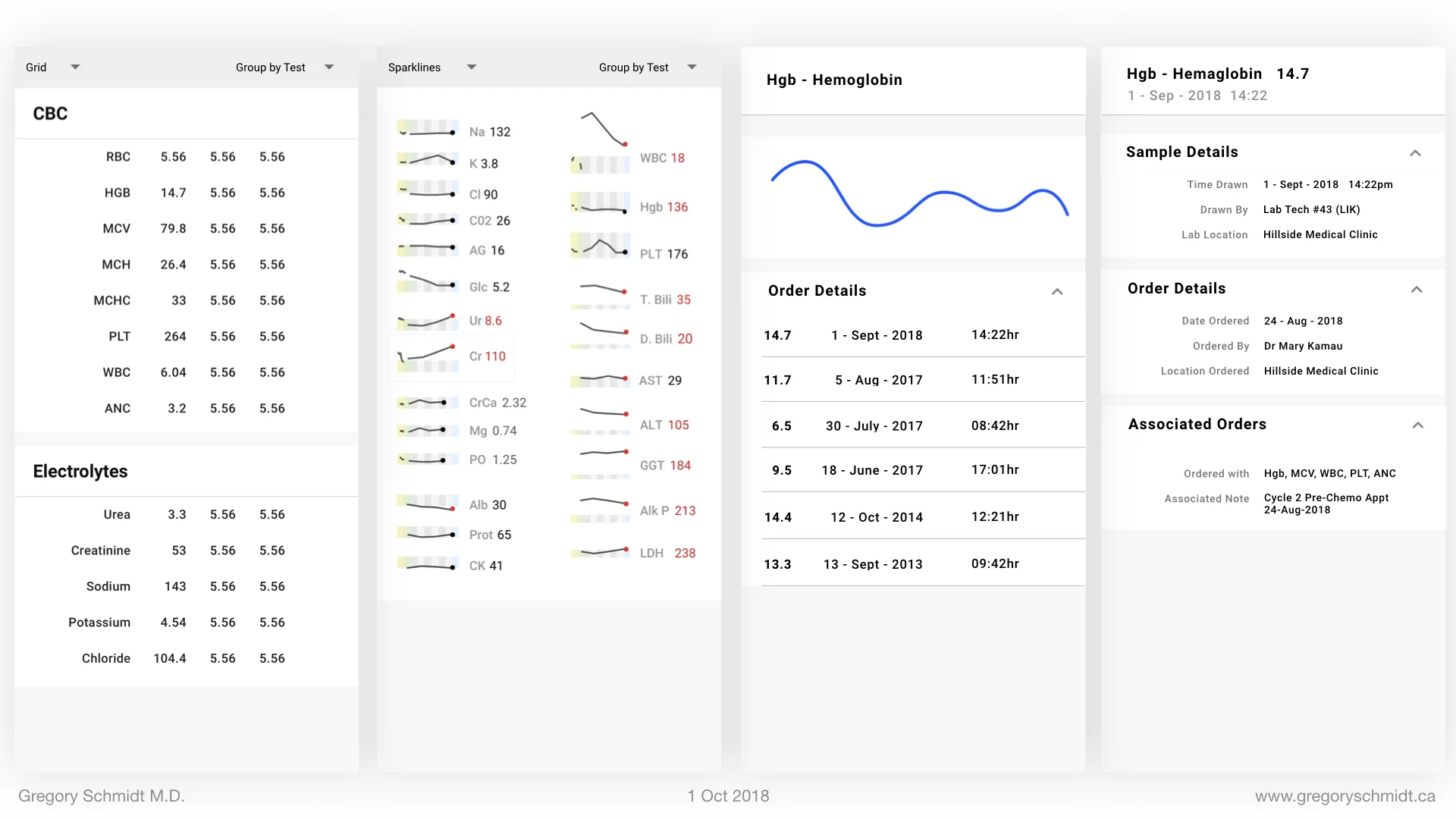
We can do the same for Labs, with the top view being a summary of the labs and there is also another summary as a ‘sparkline’. The middle view being details about a particular lab, and the third level being a detailed view.
Imaging follows the same pattern. Same with Clinical notes, patient demographics, etc.
Selectively View, Sort, and Graph
Admittedly the idea that we can display a single summary of medication, labs, notes, or imaging on a single summary page is optimistic. People may want to view each of these Sources multiple ways.
For instance, for medications – you may want to see the active ones, or the inactive ones, or both. You may want the list to be sorted by only abnormal labs, or by program rather than the test, or by date it was drawn or date it was reported.
We can group these options into the categories of VIEW and SORT/GROUP. The same grouping can be applied to all the other summary panels. This provide incredible flexibility having 30 - 40 - 50 unique overview panels, concealed behind 4 panels.
Expandable Timeline
The objects in the timeline can be expanded when needed to view more detail.
Future Timeline
The timeline can also be used to not only see what happened, but look ahead into the future. Upcoming appointments, tests, and pending results and be displayed by scrolling in the other direction.
Bookmark
When using a paper chart, it is very helpful to pull out specific files and lay them out across a desk. This workflow is very difficult to do in the EHR where each file is separated into its own panel and window.
To create this workflow - any piece of data can be bookmarked, and added to a bookmark list. These can be shared between clinicians or attached to the patient chart.
Mini-Timeline
The mini timeline is an experimental feature at the bottom of the page. When viewing a specific object (eg. a lab result, order, clinical note, chest x-ray, etc) the user can see that object in the timeline, as well as the objects that occurred before and after it.
The purpose of this view is to add context. It makes it really easy to always know what happened before or after a particular object.
This makes the Bloodhound and detective workflow really easy.
To see an example of how this film strip works, one can look at Apple iMessage. As you scroll it enlarges quickly and you can see more details.
Action Panel
We have discussed to date the general layout and ways to read a patient’s chart. Now we move to the ‘Action’ panel. The Action Panel is where users can start visits, enter notes, place orders, and review clinical decision support.
The tricky part with the Action Panel is it has to incorporate a number of workflows. A standard HIV Clinic, to an Oncology intake appointment, to an Oncology chemo appointment. Or a patient may be seen for both HIV, Diabetes, and Hypertension at the same time; and then also require at the same time assessment for new arthralgias.
I won’t go into specific detail in this presentation how the Action Panel is able to integrate these multiple workflows, but in general there are four major components.
The Action Panel is divided into: Start, Workflow, Order, Checkout.
These mockups are very rough at the moment and for concept only. The design of the boxes is horrendous.
In short on the Start/Home page the user selects the reason the patient is there – for instance an HIV follow up visit, or a Debates Follow up visit; or both. This page configures the next section - workflow.
The Workflow panel customizes to the user type (a nurse, a clinical officer, a consultant) and integrates the forms selected on the Start page.
The Order Panel is used to place orders that are not part of the clinic workflow in the previous panel.
The Checkout Panel is the last page to review before closing the patient chart. It shows the started notes, the orders to submit, any clinical decision support reminders that were not addressed.
Relationship between Action Panel and Clinical Notes Side
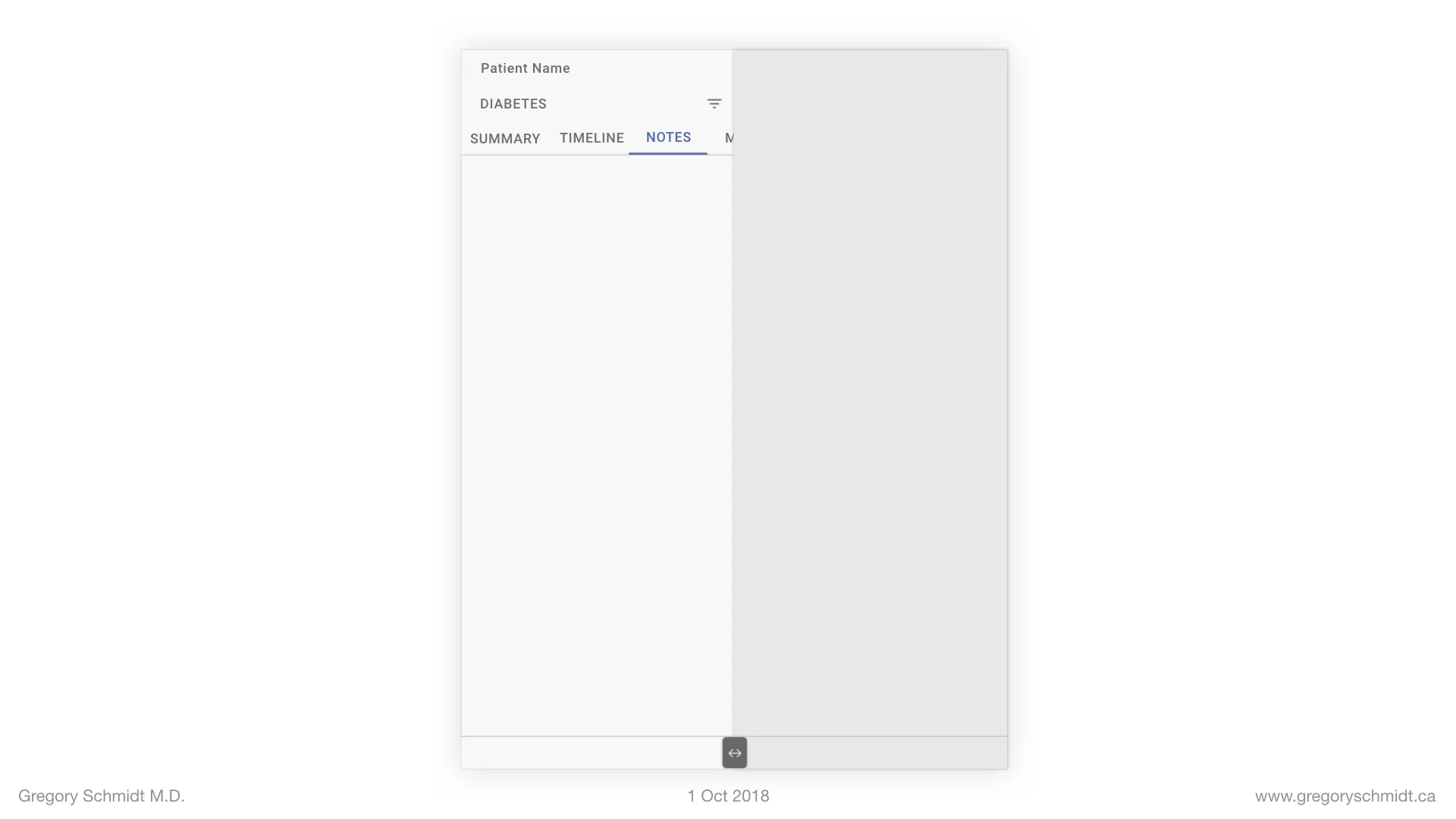
The two halves of the split screen interface interact with each other.
For instance the Action panel can influence the Clinical Notes side:
(a) When the user is in the Action Panel, and they come to the workflow part to enter physical exam information, the clinical side shows the past physical exam details
(b) When the user in the Action Panel is in the HIV question workflow, the Clinical notes side filters to HIV view.
For instance the Clinical Notes can influence the Action Panel.
(a) When a user is viewing a potassium result in Clinical Notes, the Action Panel can open to a space to write a clinical note related to this, or to place a relevant order.
(b) When the user is viewing medications, the Action Panel can open to the orders tab to have ability to continue or change the medication prescription.
Home Screen
As we are wrapping up here, let us not forget the Home Button.
Here you can search for patients.
Or a patient list can be generated for the clinic based on your clinic location and user role.
The home screen can be used for other modules such as educational material, medical record training materials, news feeds, updates of labs and tests pending on the patient, messages.
A sample of a top left hamburger menu shows parts a place to place features that are outside of the clinical note, such as server setting.
Summary
There
CHAPTERS: EHR Mockup Presentation Oct 1, 2018
Best to read in order, or even better - watch the video:
Introduction: EHR Design Mockup - Oct 1 2018
EHR Requirements: Many types of users & devices
Part 1: Multi-Screen & Multi-Tasking EHR UI from First Principles
Part 2: A single user Interface to group clinical data 6+ ways
Part 3: Electronic Medical Record Interface Panel Ideas
Please note: these designs are simply a ‘slice in time’. The project as of Oct 1. They are in no ways a ‘final version’. There are many things I do not like about these in their current state as published.. Also, the design focus here has been on functionality. The designs have not be optimized yet for esthetic design.

