EHR Requirements: Many different users & devices
This is a Chapter from the presentation: Chapter Index: EHR Design Mockup - Oct 1 2018.
The presentation is available at:
Expansion of users and programs
The challenge we are facing is that the because of the popularity of the point of care (POC) electronic medical record, more and more clinics and sites are asking for it. The system was originally developed for HIV care, but as we expand it to new departments and uses outside of HIV a more general purpose EHR is required.
Some of the challenges to be faced include:
Multiple Devices
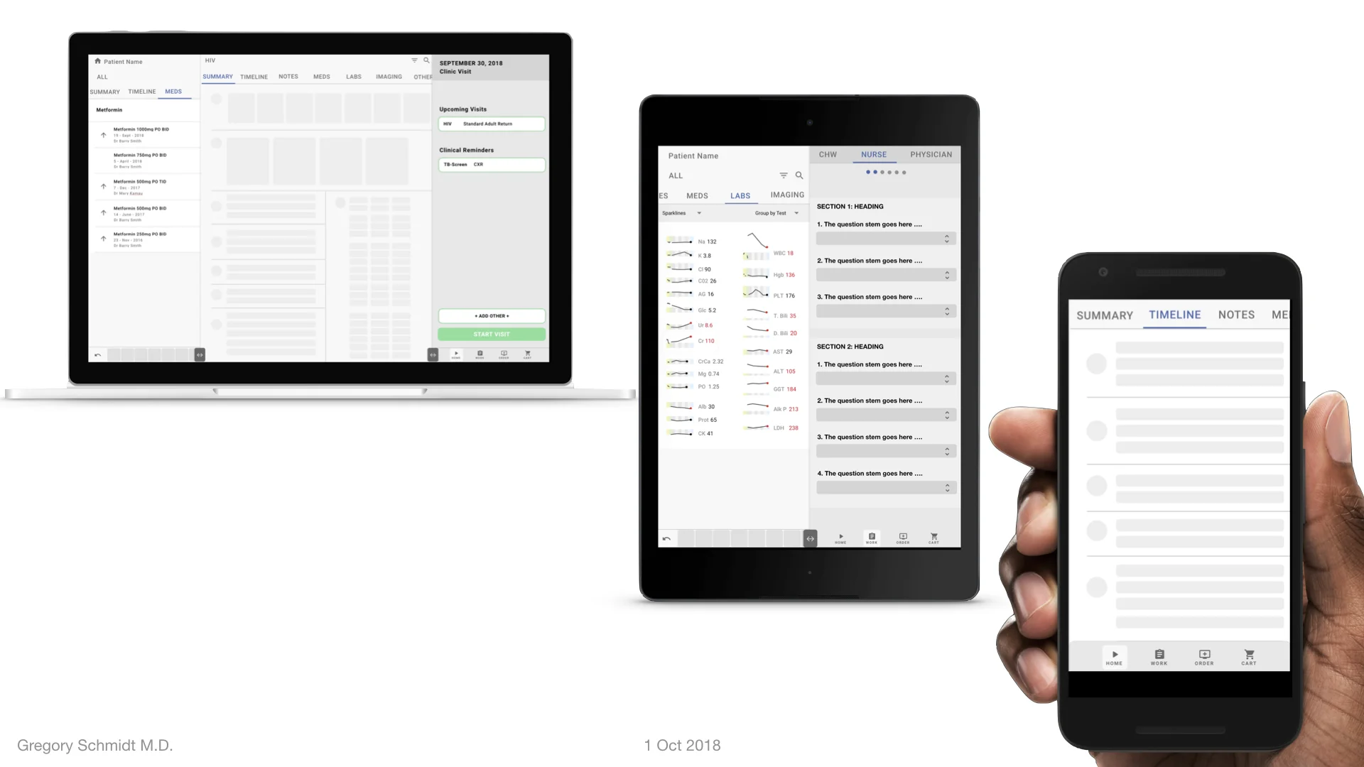
The challenge includes, designing a system that works on multiple screen sizes from phone, to tablet to chromebook and desktop.
Multiple Users
There is a wide cross section of users. They can be grouped roughly into three categories
1) Entry Level Users: such as community health workers and other users who have never used a computer before. They require a simple and straightforward system to register patients, and collect form data such as blood pressures or discrete questions.
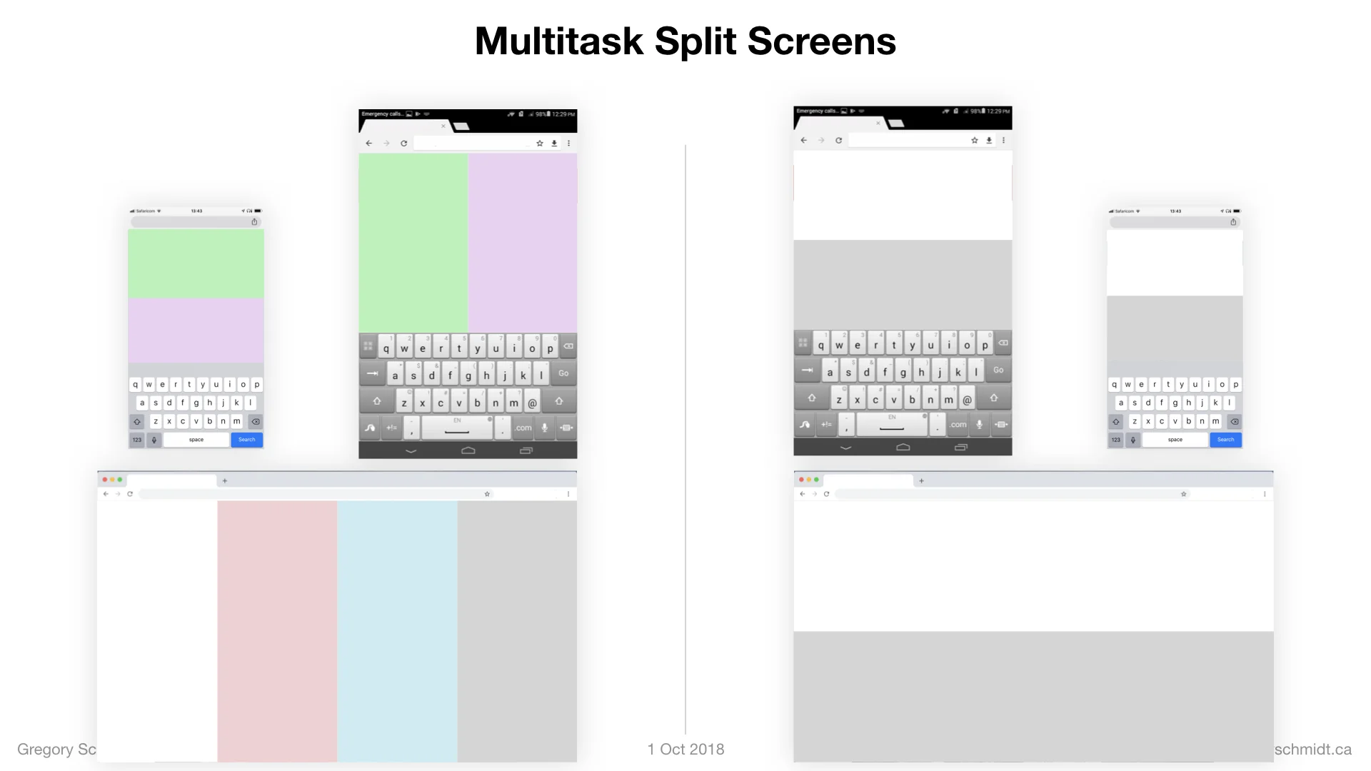
2) Middle Level: is the largest group. These are nurses and allied health workers, and clinical officers who work primarily off of tablets. They may complete forms with pre-specified questions and answer choices. During their work there are times when the users need to multi-task and review past labs, bloodwork, or old notes in the middle of their workflow.
3) Power Users: these may be consultants or clinicians who require an in depth look into the patient chart. Often they are on a Chromebook or Laptop. Most of the time they are in a standardized clinic workflow, but at times there is a medical dilemma that needs solving and they need to review dense medical data while writing orders and a consultant note.
User Satisfaction
Unlike North America where clinicians cut the EHR a surprising amount of slack for its shortcomings, I’ve noticed here in Kenya all users judge the system based on if it is as easy and responsive as the other mobile phone apps they use. A high bar indeed.
Ultimately what we roll out to users has to be very easy to learn - because we will be adding quite a number of users this year and would like to make training as easy as possible.
—> NEXT —> MOVE ONTO: Part 1: Multi-Screen & Multi-Tasking EHR UI from First Principles
CHAPTERS: EHR Mockup Presentation Oct 1, 2018
Best to read in order, or even better - watch the video:
Introduction: EHR Design Mockup - Oct 1 2018
EHR Requirements: Many different users & devices
Part 1: Multi-Screen & Multi-Tasking EHR UI from First Principles
Part 2: A single user Interface to group clinical data 6+ ways


