Full Stop on Apple Ads
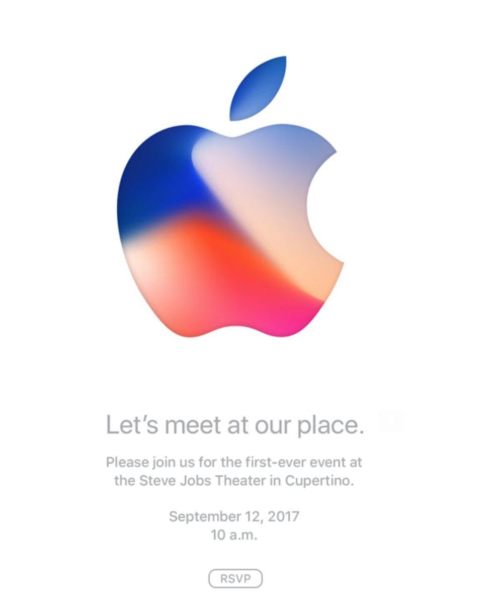
Apple's Invite
Apple's invite to their September Event uses a full stop (period) at the end of most lines.
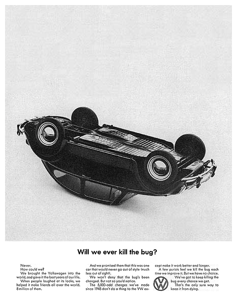
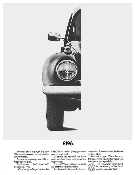
I was talking with a friend about this. He mentioned the use of full stops at the end of lines is Apple's "thing". They have always done this. A look at their old ads (bottom of page) certainly confirms this is true.
Interestingly, even their "Think Different." trademark is followed by a full stop.
This makes me pause. I’ve always been strongly opposed to full stops on posters. They serve no purpose. There is not need to punctuate space between two sentences, when the second sentence isn't there. The white space, line spacing, and changes in text size and weight sufficiently divides ideas.
My friend, who is quite reliable, postulated Apple's use of the full stop makes their copy more 'approachable'. Ok. I can see that. But where did this trend originate?
Trend of Full Stops on Posters
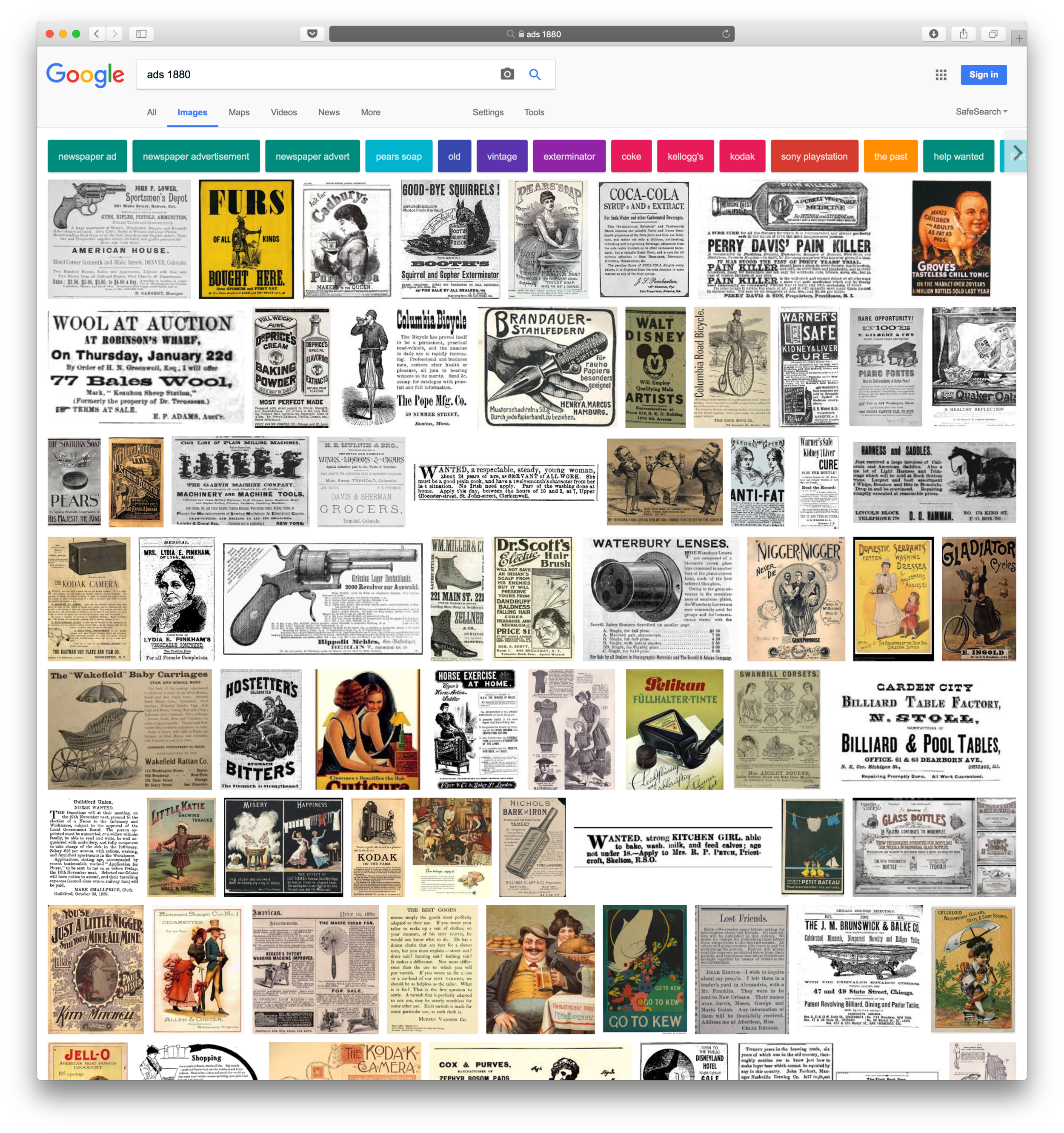
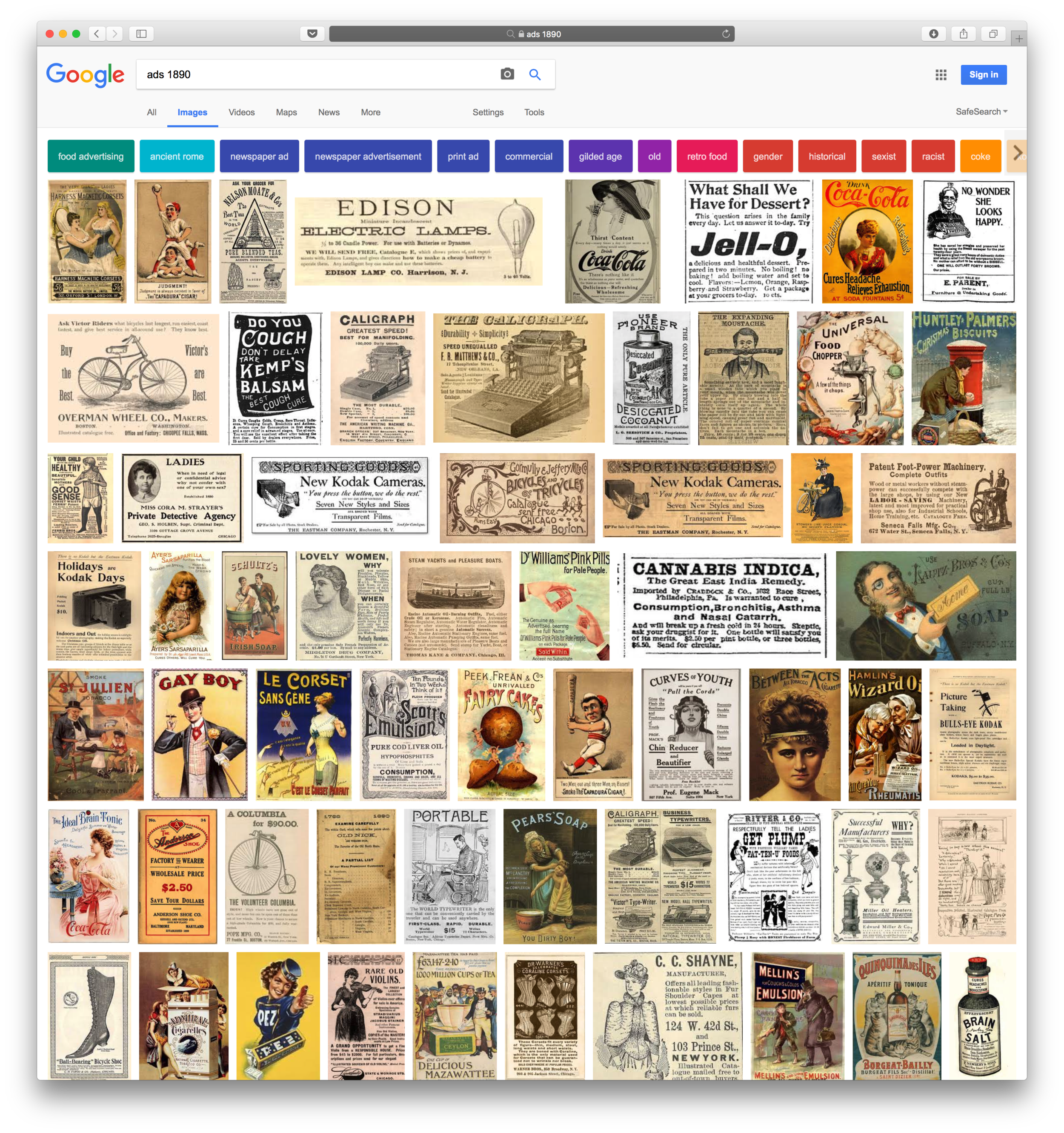
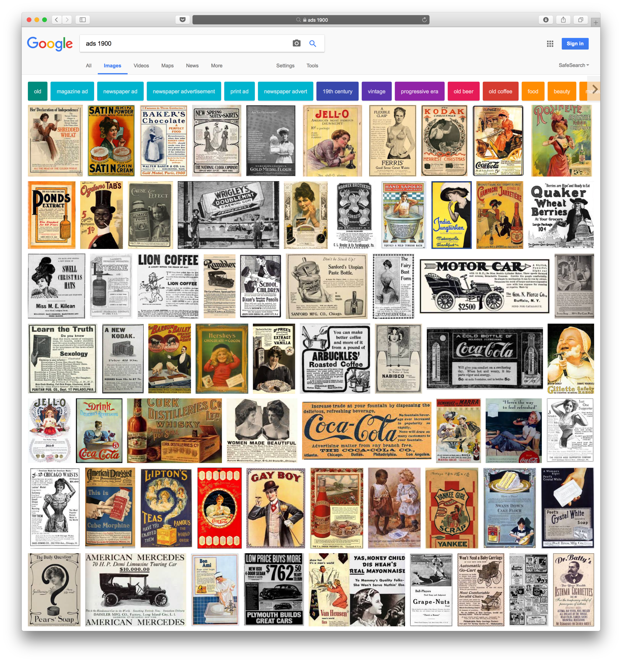
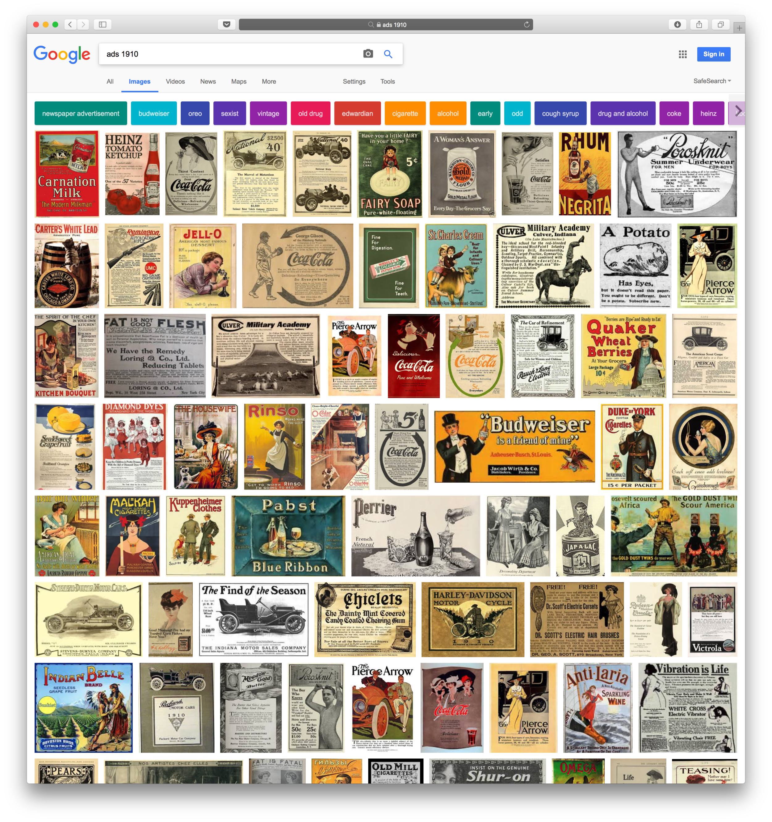
A Google Image Review (bottom of page) shows that pre 1900s, the use of full stops in advertisements was variable. During the 1900s through 1950s full stops were barely used at all on heading lines.
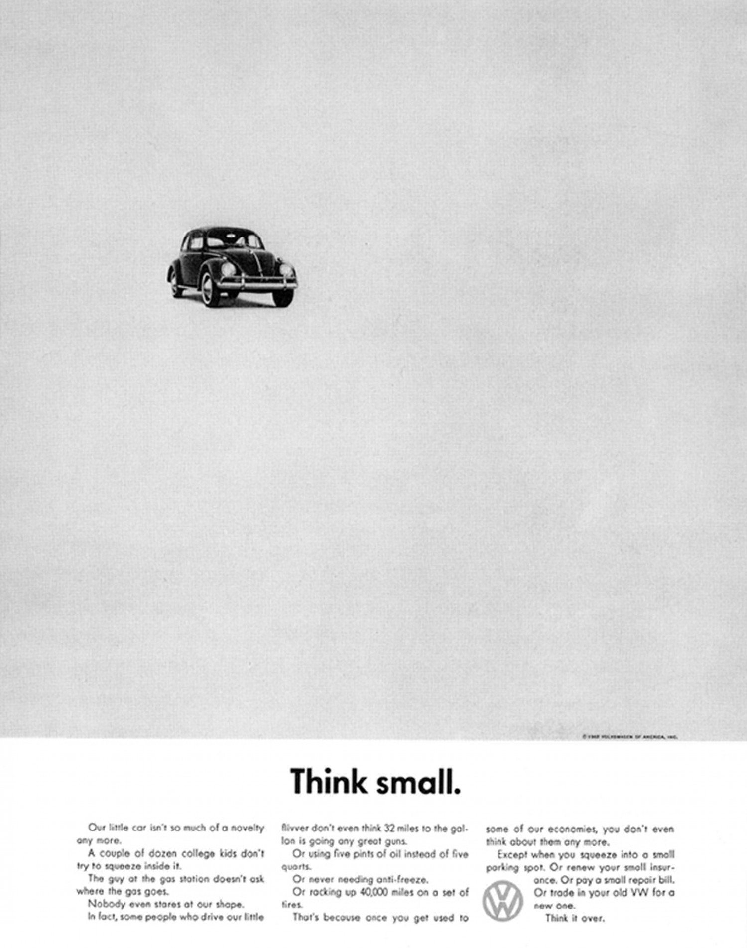
In 1958 it all changed. This article attributes the start of the full stop style to Helmut Krone while working at Doyle Dane Bernbach on the famous "Think Small" ad campaign for Volkswagen.
Krone adapted the traditional 'Ogilvy Style' ad with a large image at top, headline, caption, and copy underneath. He changed the header text to a sans-serif typeface and placed a full stop at the end.
"Putting a full stop after headlines would eventually become a trademark for Krone"
- article, 'The Ad that changed advertising'
This style would catch on and become the norm for the next three decades. (article, Was Helmut Krone a Genius?)
Apple continues to use the old style
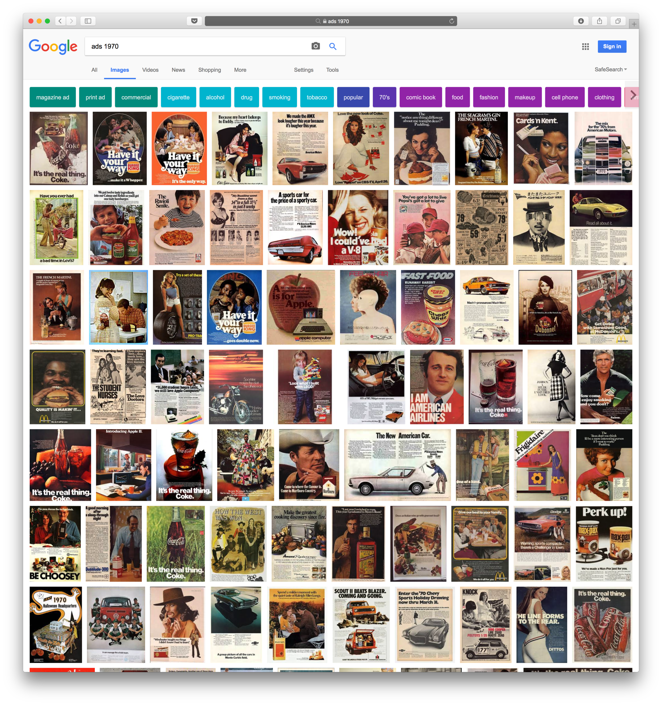
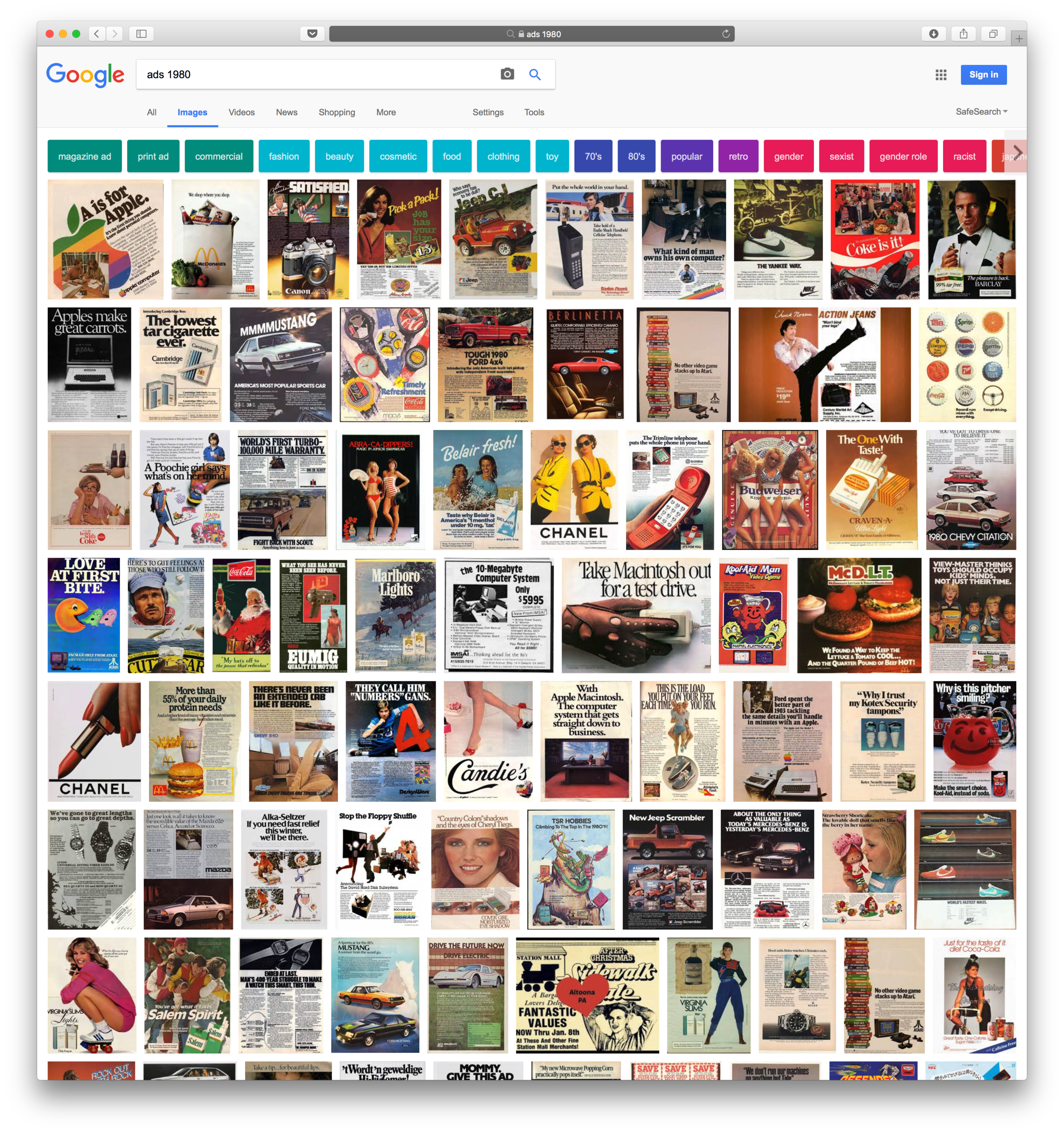
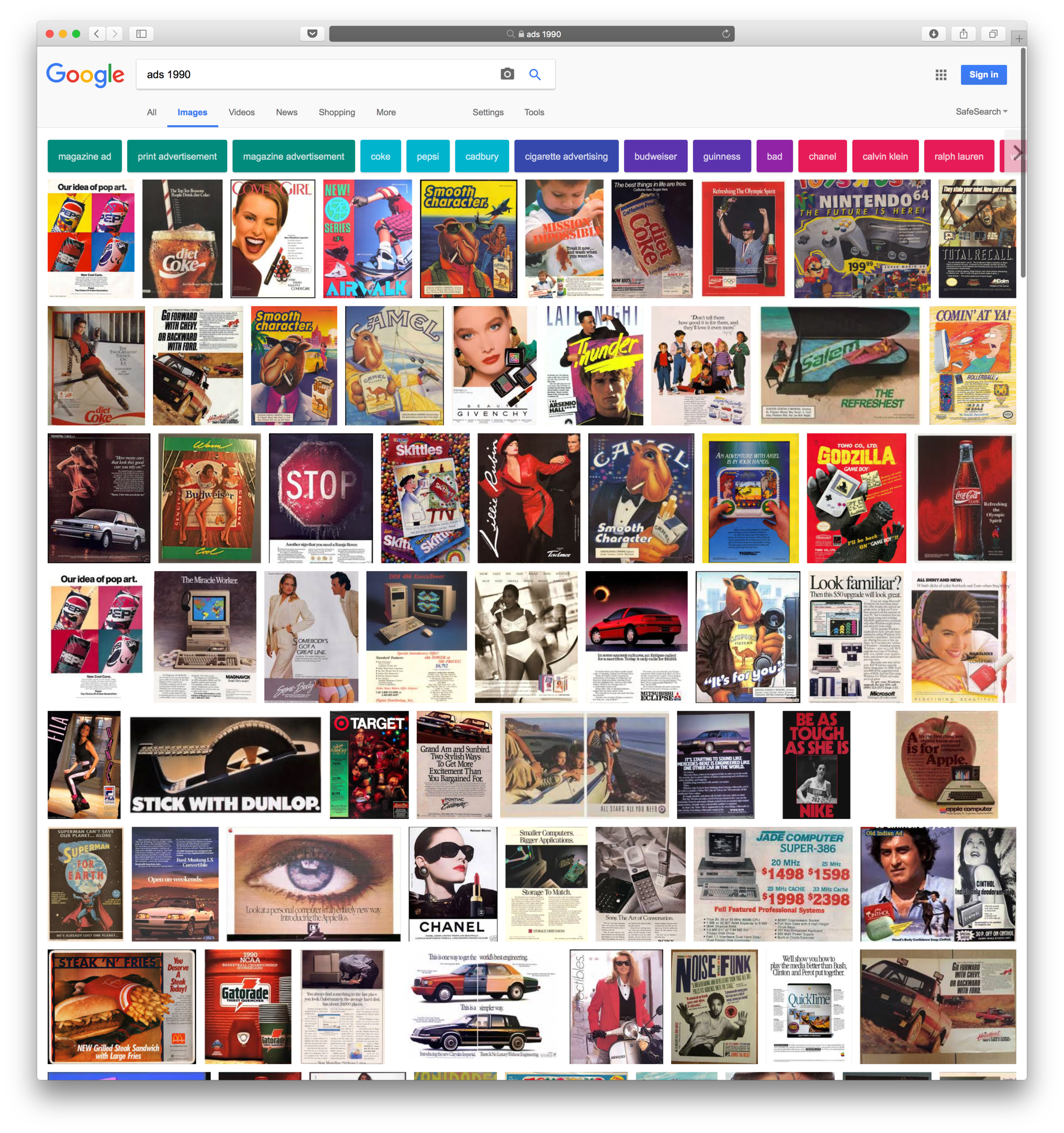
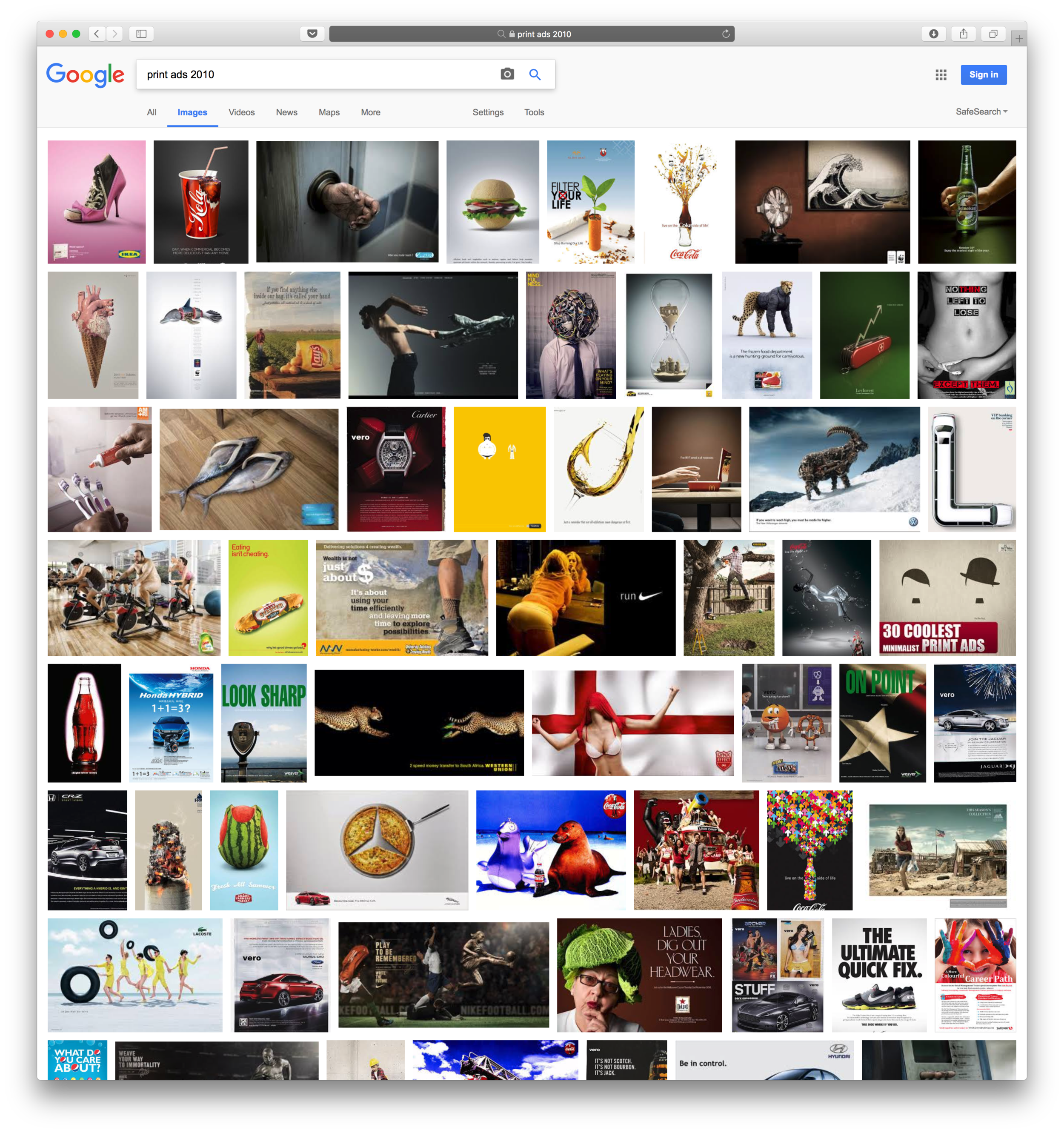
Review of Google Images shows the full stop and highly punctuate heading style fading out by the 1980s and 1990s. However, Apple continued to use the 1960s Krone inspired full stop style since their original posters half century ago. In addition, Apple’s adds continue to reflect much of the original humour and style of the 1960s advertisements by groups such as Doyle Dane Berbach and Olgilvy.

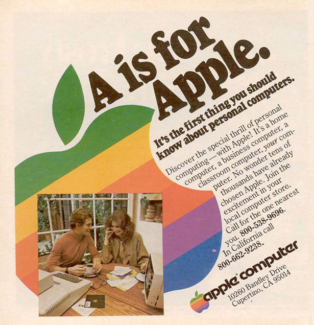
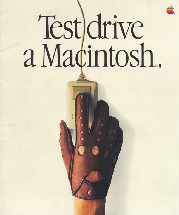
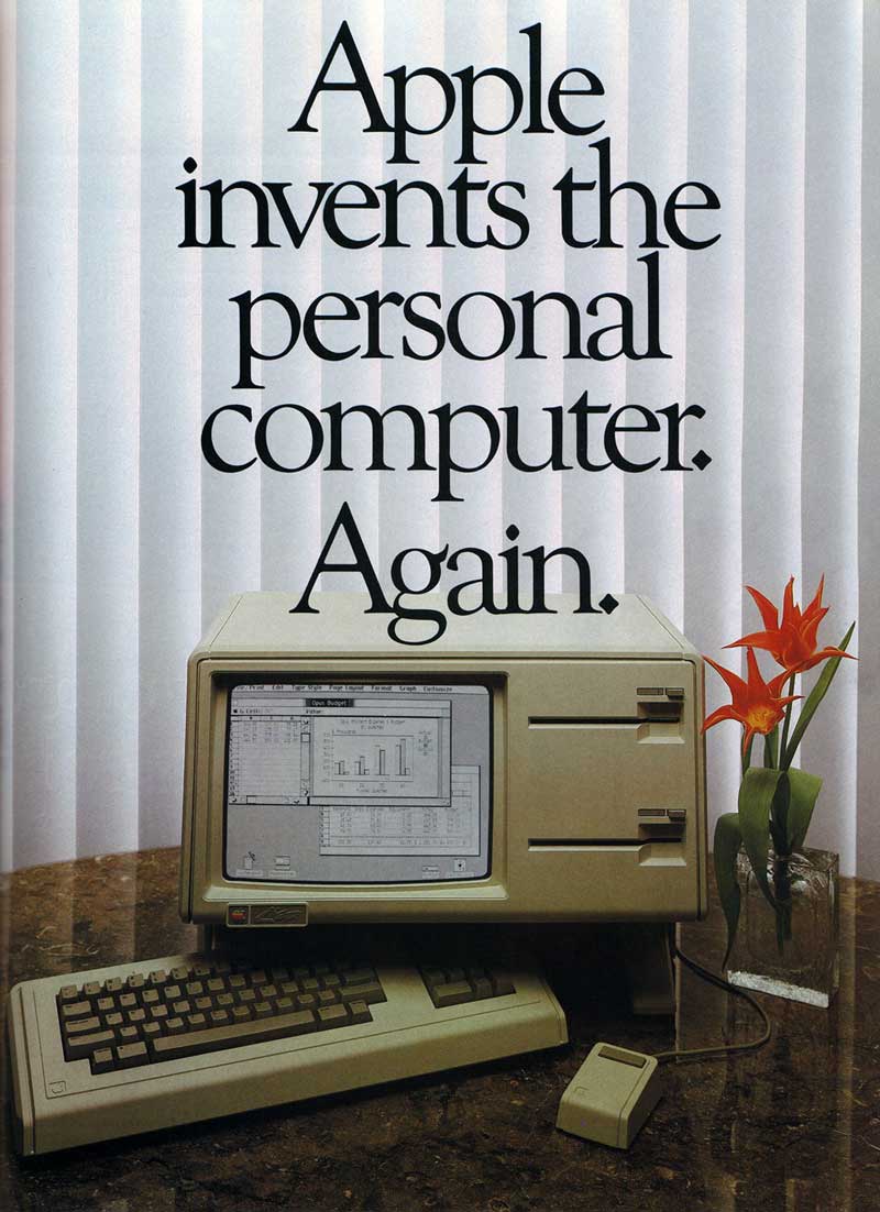
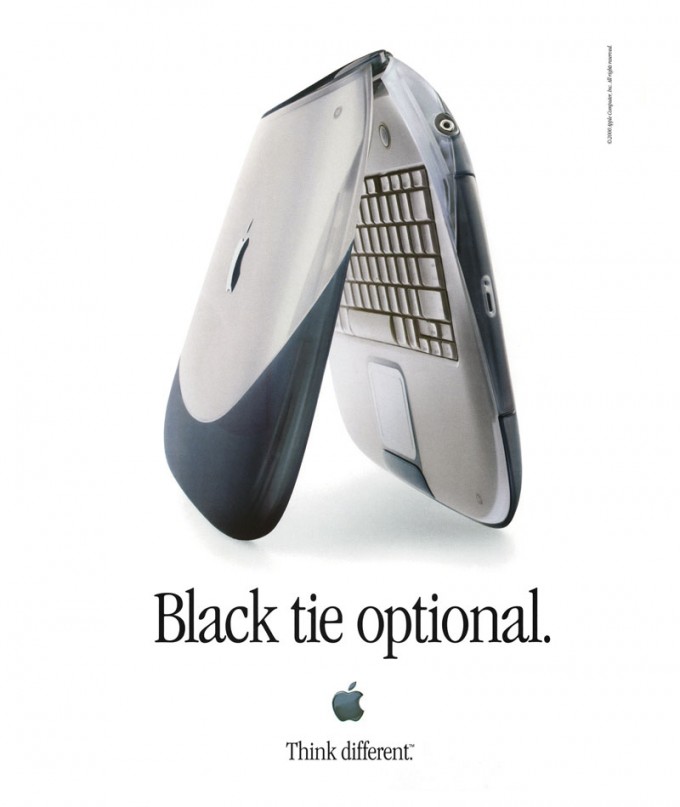
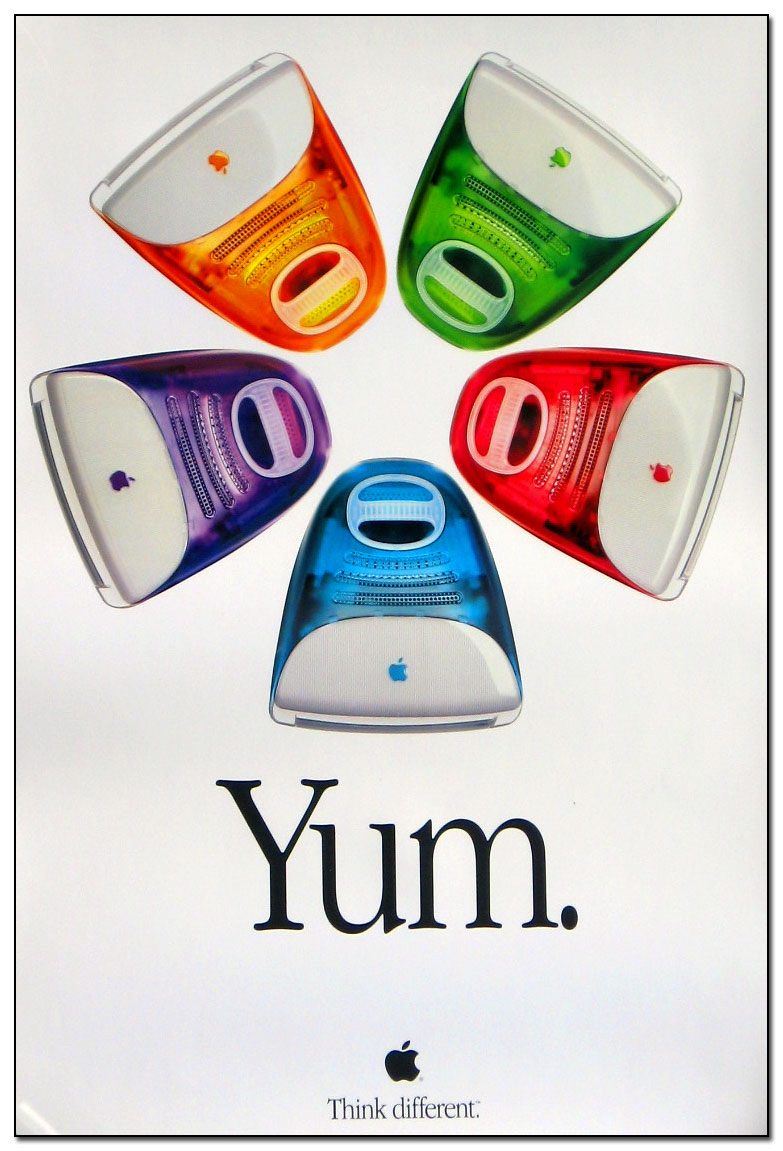
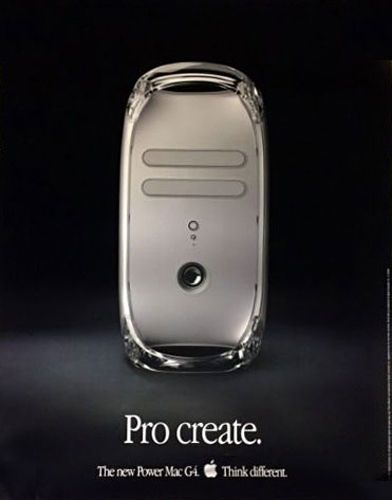
Full Stop posters by decade
A preliminary review of some old ads is compiled into this carrousel.
A Google image searches in the decades between 1840 and 2010 shows the variable frequency of the full stop style pre 1900. General absence in 1900s-150s. Heavy use in the 1960s-1980s. And taper off in the subsequent years.

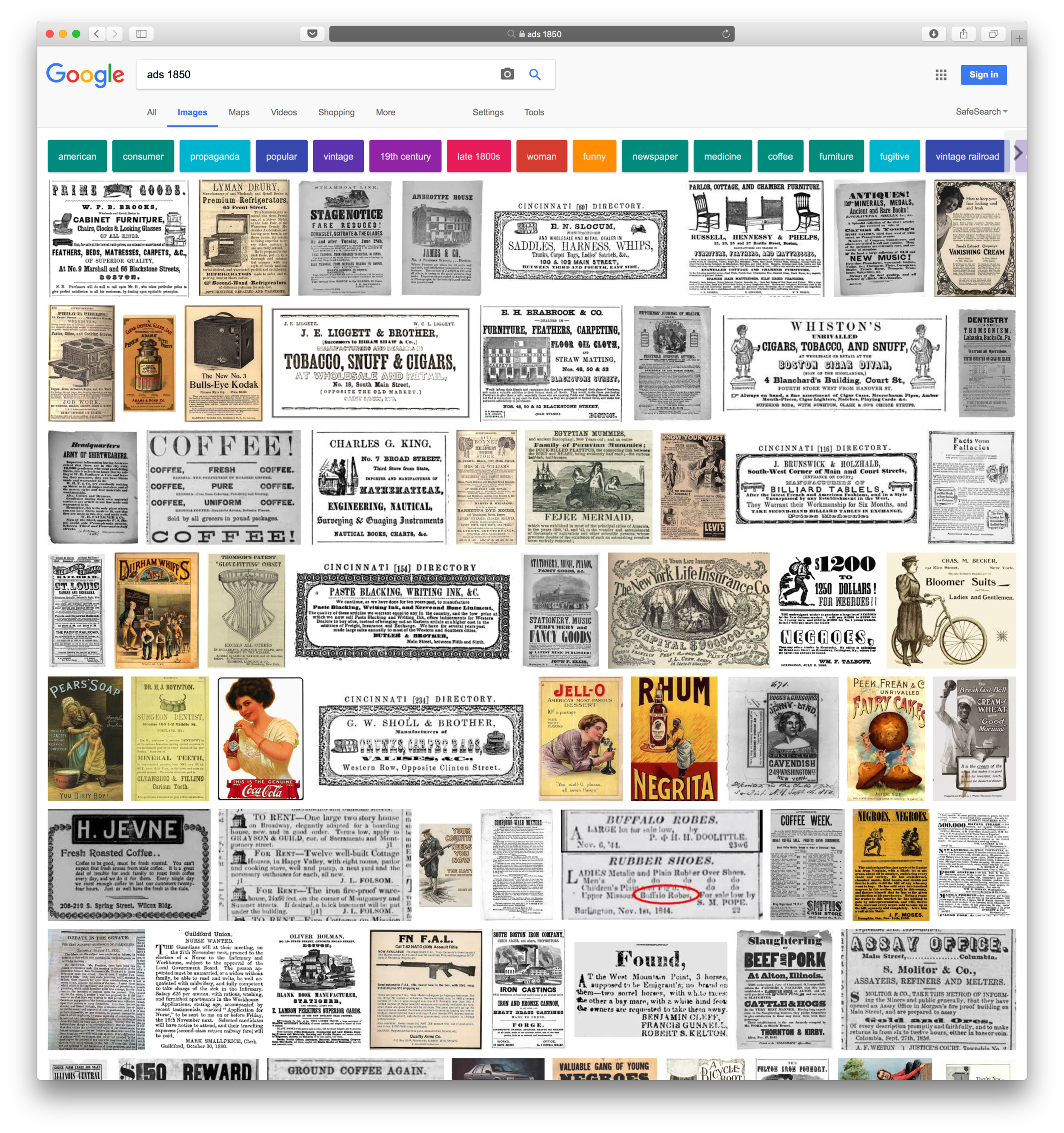
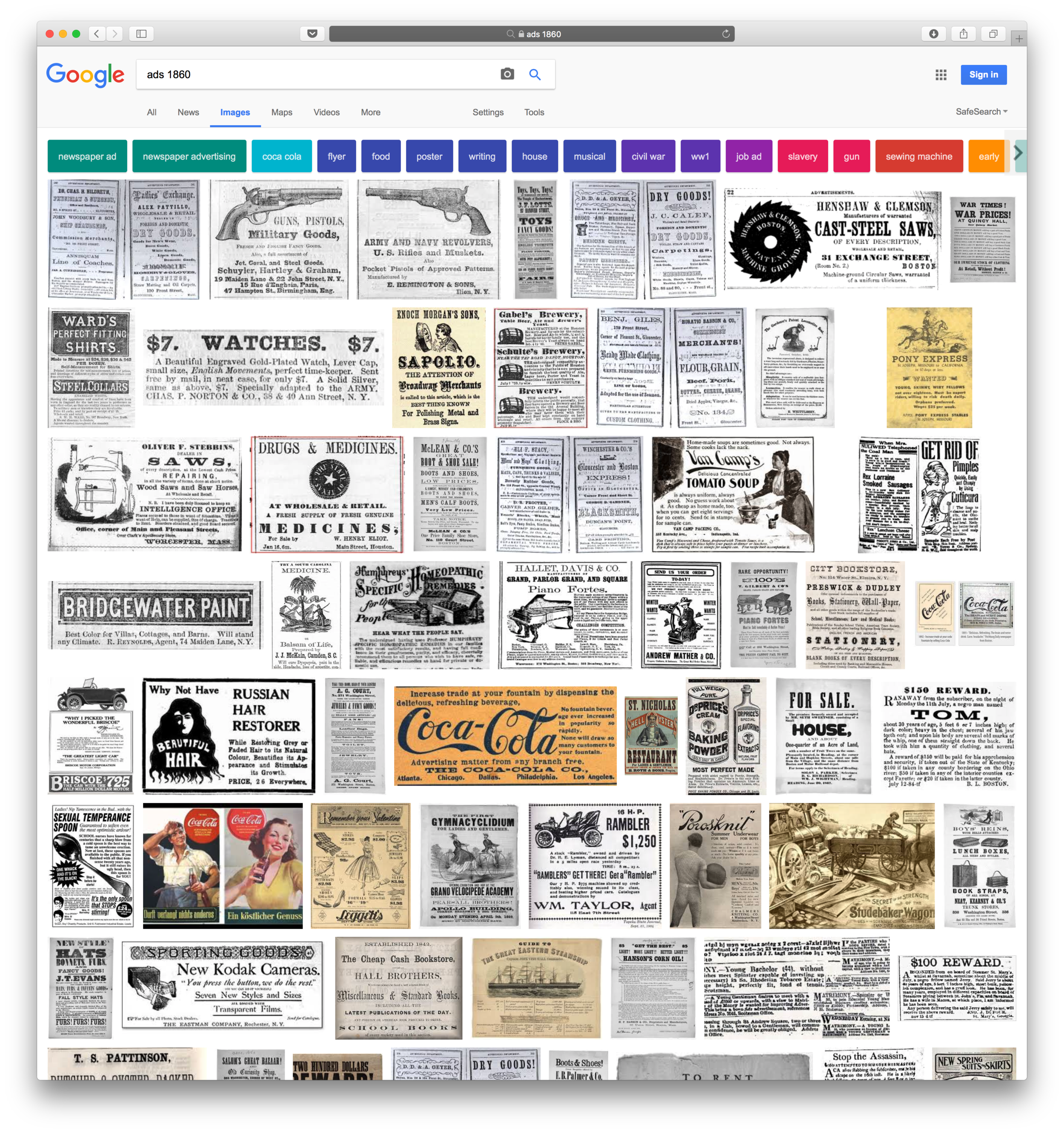

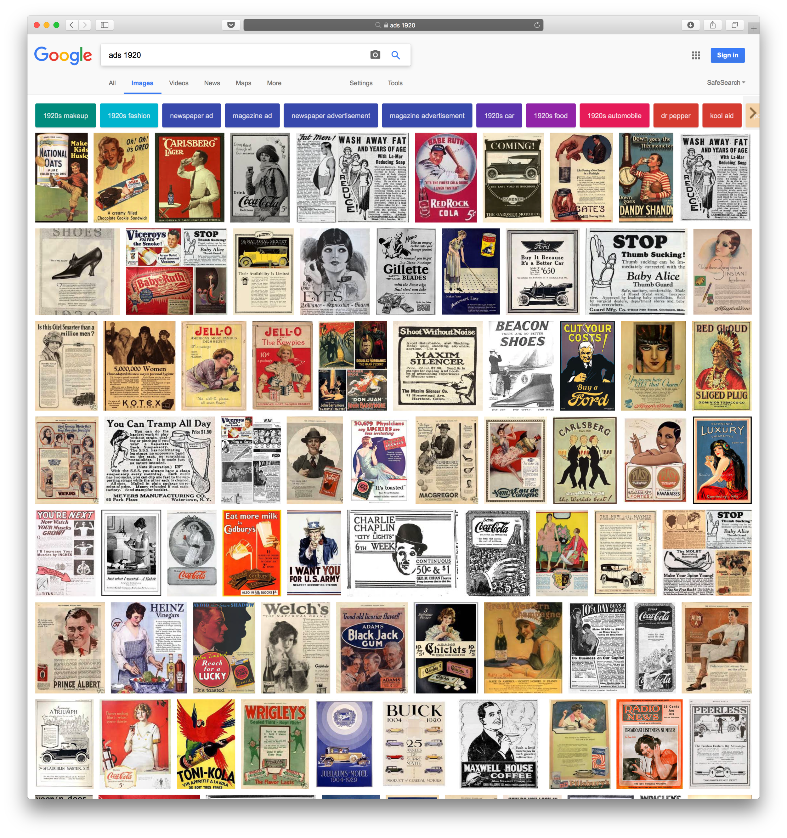
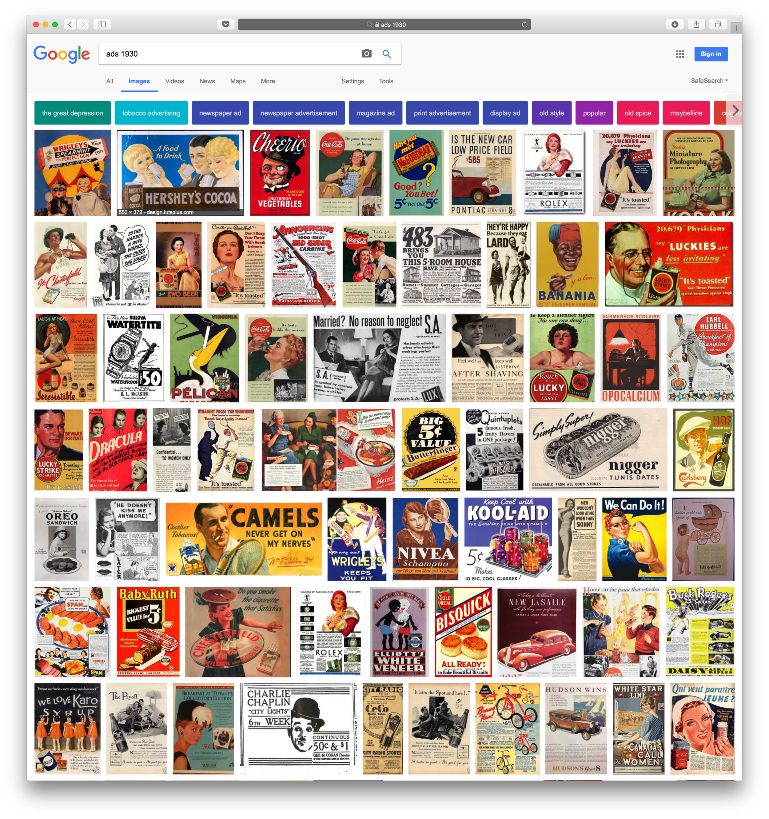

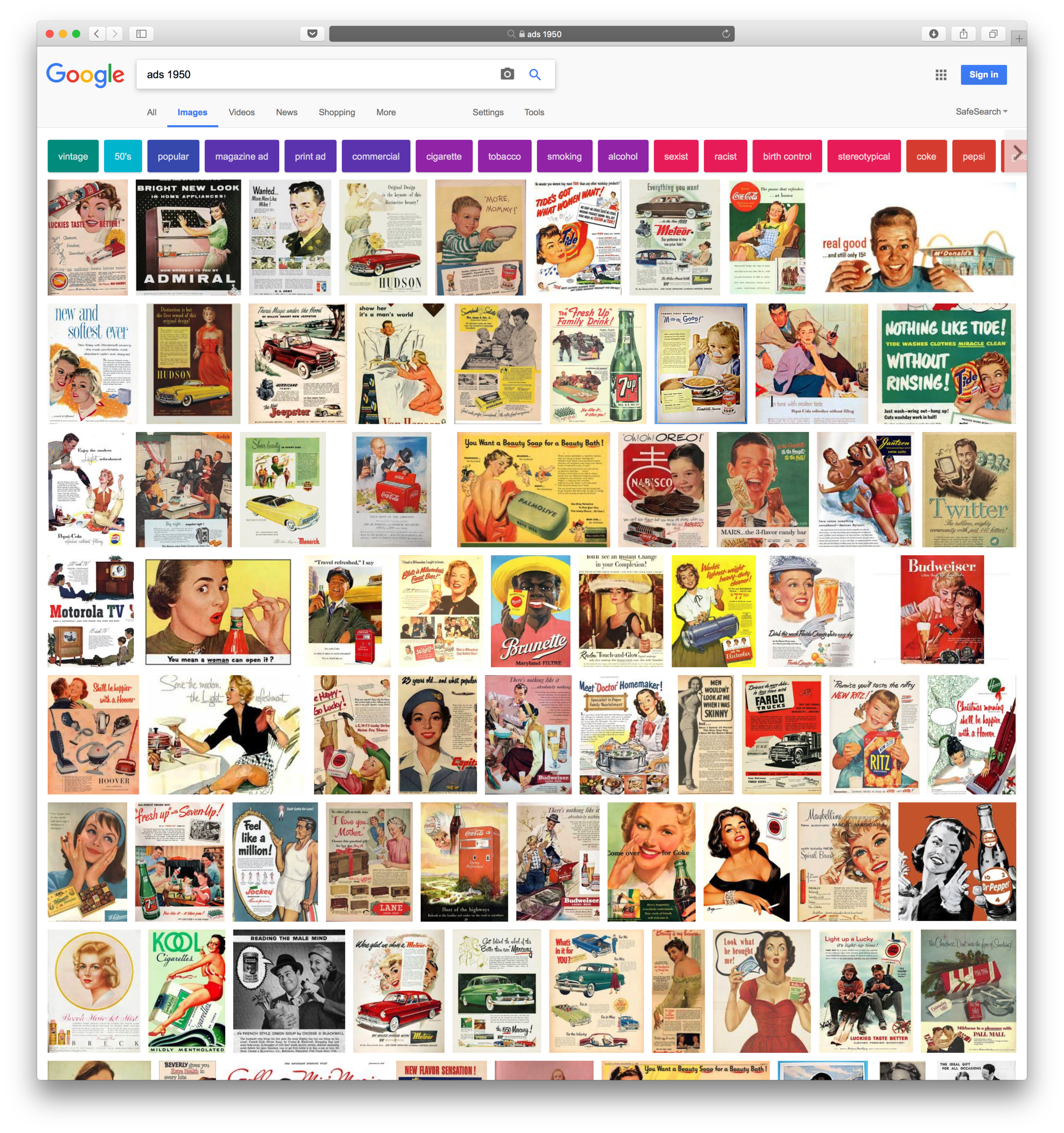
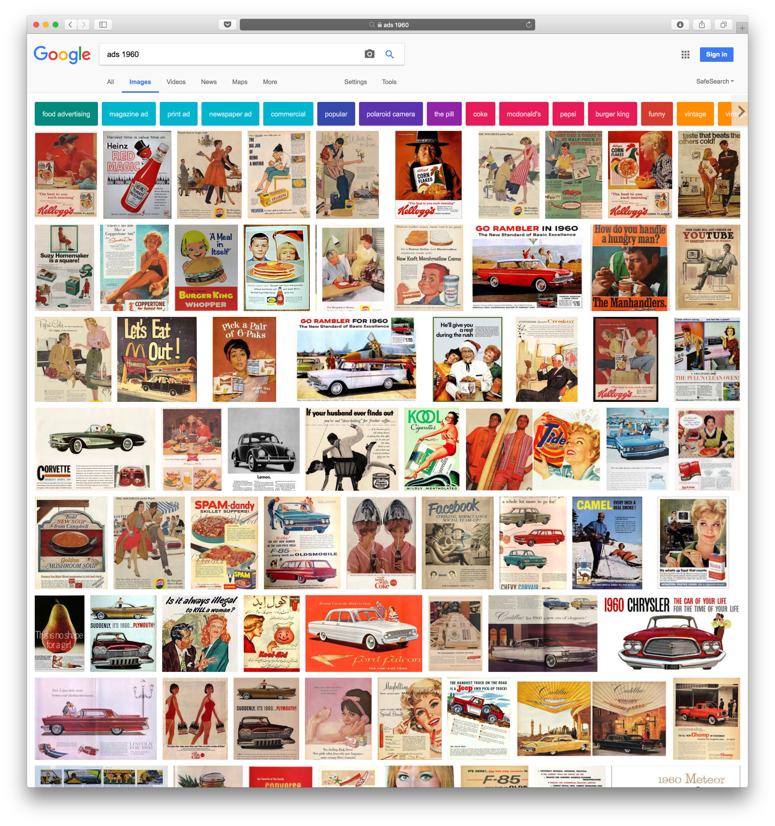

If anyone knows any more details about the history or trends of the use of full stop after headers in advertisements this please let me know. There seems to be very little concrete details on the subject. Also, is there any published history on the background of Apple's choice to style their ads with full stops? Does objective research exist on consumer perception of full stops on posters as being friendly vs formal, conversational or inviting?
Resources
The man himself, Helmut Krone discussing some of his work,

