High Data Density Hospital Phone Cards (Print Design)
Hospital lanyards have multiple ID badges and information cards attached. One of these often has phone numbers.
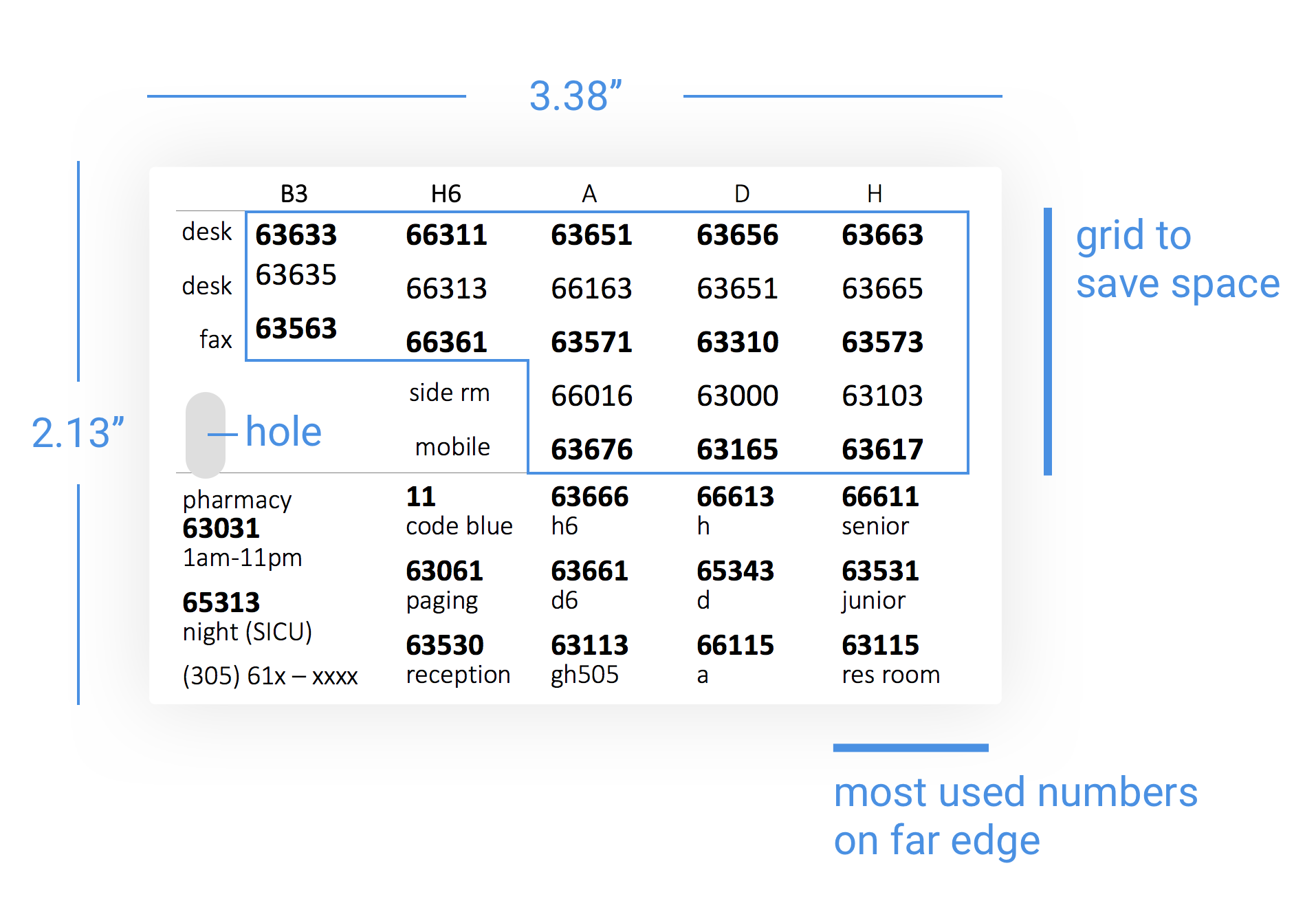
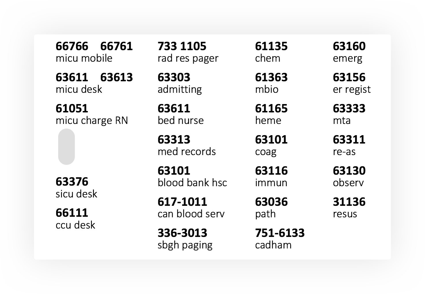
This article proposes an improved design to maximize data density and clarity. It legibly displays 63 individual phone numbers and their titles on a piece of paper the size of a credit card. There even remains room for additional numbers.
This high data density design is achieved using (1) stacked text (2) font size variation and (3) a grid layout.
1) Stacked Text
Traditional Layout: Two Columns
Most phone cards use a two column approach. Titles down the left, phone numbers down the right. If one is lucky periods connect the two.
The problem is the eye has to scan across the card. Often the distance between the two items is too far. Scanning the card is slow and introduces error. This layout also falls apart if there are lots of items in the list, the text is small, or if there is variation in the length of the titles. It also takes up a lot of space.
Preferred Layout: Stack Text
By stacking the number above the title, one can achieve higher data density and greater clarity. The number and title are visually part of the same information block that the eye can consume without scanning.
Most importantly in our case, this layout save space. The whitespace padding below the number, and above the title disappears into the same object. Compare this to the traditional two column layout where each number and title require whitespace padding around all 4 sides.
The stacked text leaves more room horizontally on the page for whitespace adding more clarity to the card.
Most lanyard phone cards I have seen are orientated in portrait. This creates a long column. Using the card in landscape creates multiple shorter columns that are easier to find information in. Multiple columns accommodates titles of varying length. Longer titles rad res pager, admitting are grouped together, and the similar for sorter titles chem, mbio.
2) Font Size Variation
The vertical space between number-title blocks can be reduced with variation on font size and weighting. Bolding the numbers makes the start of each number-title block stand out. Reducing the size of the font for the titles adds additional variation
The byproduct of this styling also ensure the most important information - the phone number - remains the clearest to read, while information that is less crucial - the title - falls into the background. After one uses the card multiple times they will know where the number they are looking for is visually located, and this makes the titles even less important.
3) Grid
Most phone number cards have similar information (left column: desk phone numbers, faxes, mobile numbers, side room numbers) for different wards (top row: B3, H6, A, D, H). Placing this information in a grid removes multiple titles.
In this case, the most important phone numbers for each ward the desk and mobile number are placed at the top and the bottom of the grid respectively. This draws the eye easiest to them making referencing quick.
The most important information is placed towards the outside edge of the card (away from the lanyard hole) as this is most accessible when on the lanyard.
Printing
If the cards are laminated, ensure the edges are slightly rounded, as they are sharp.
Download Microsoft Word Template
Multi-Card stack for double sided printing
All phone numbers used here are fake.
Thanks to: Edward Tufte's writings for inspiration on this project.
Any feedback is always appreciated.
Update
Edward Tufte has recomended tracking the numbers out to increase clarity - as seen in his New Haven Rail Road schedule re-design.
The font used is Bell Centennial. Originally created for telephone directories.
from page 105, Envisioning Information. By Edward Tufte.


