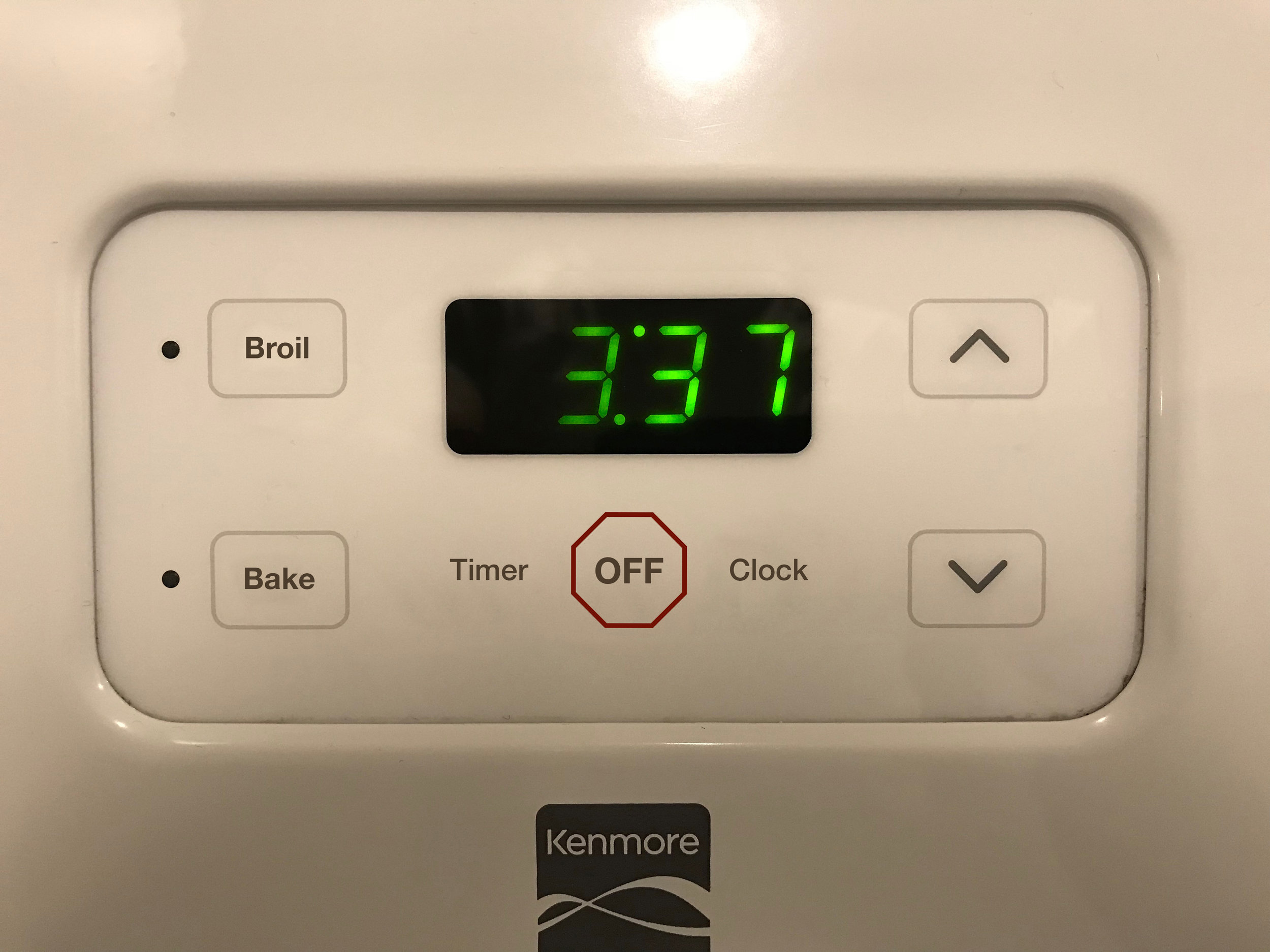
Kenmore Oven Dial Redesign
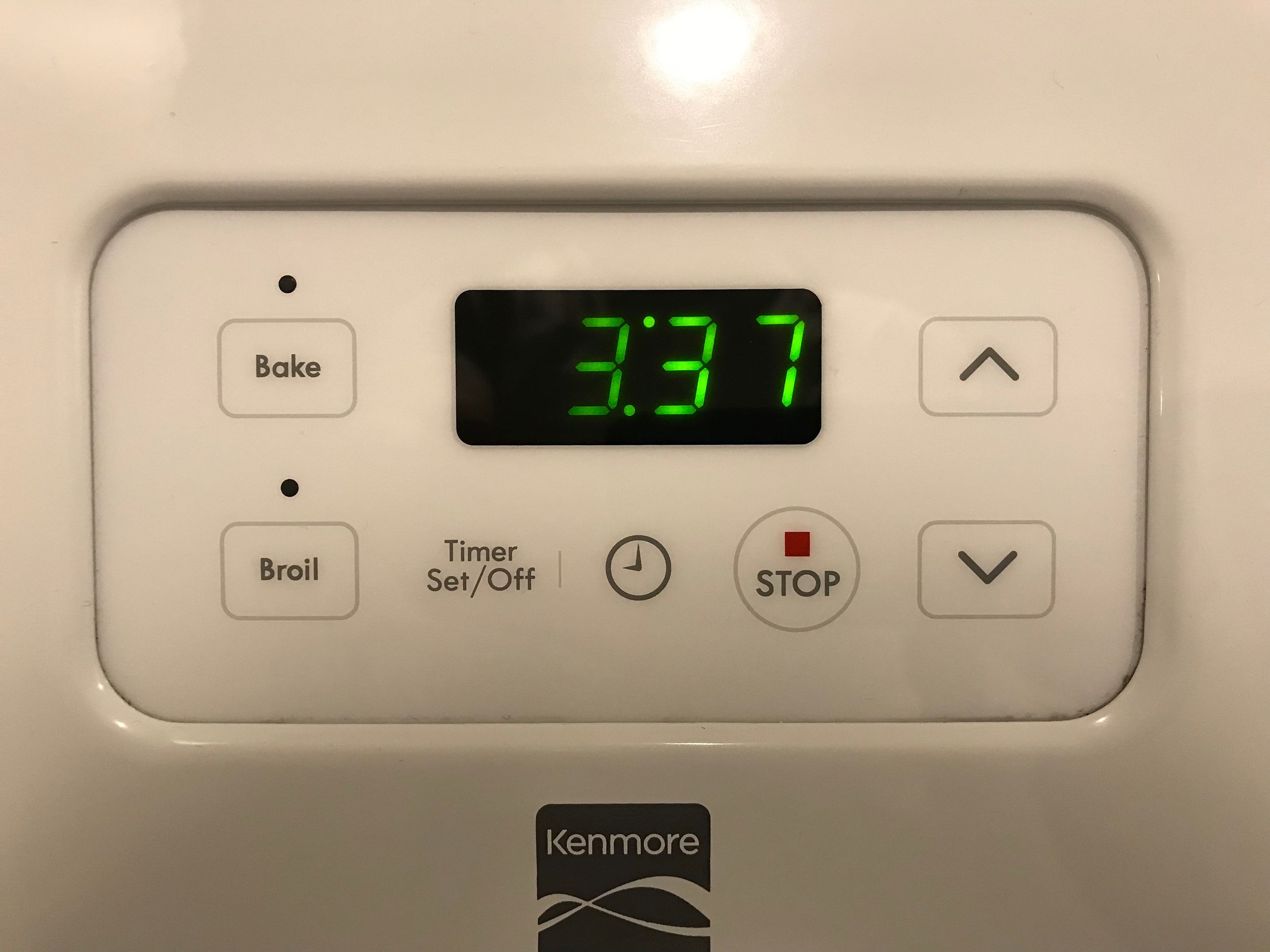
The Original Kenmore Oven Display
This display has some obvious problems with it. Lets work through them
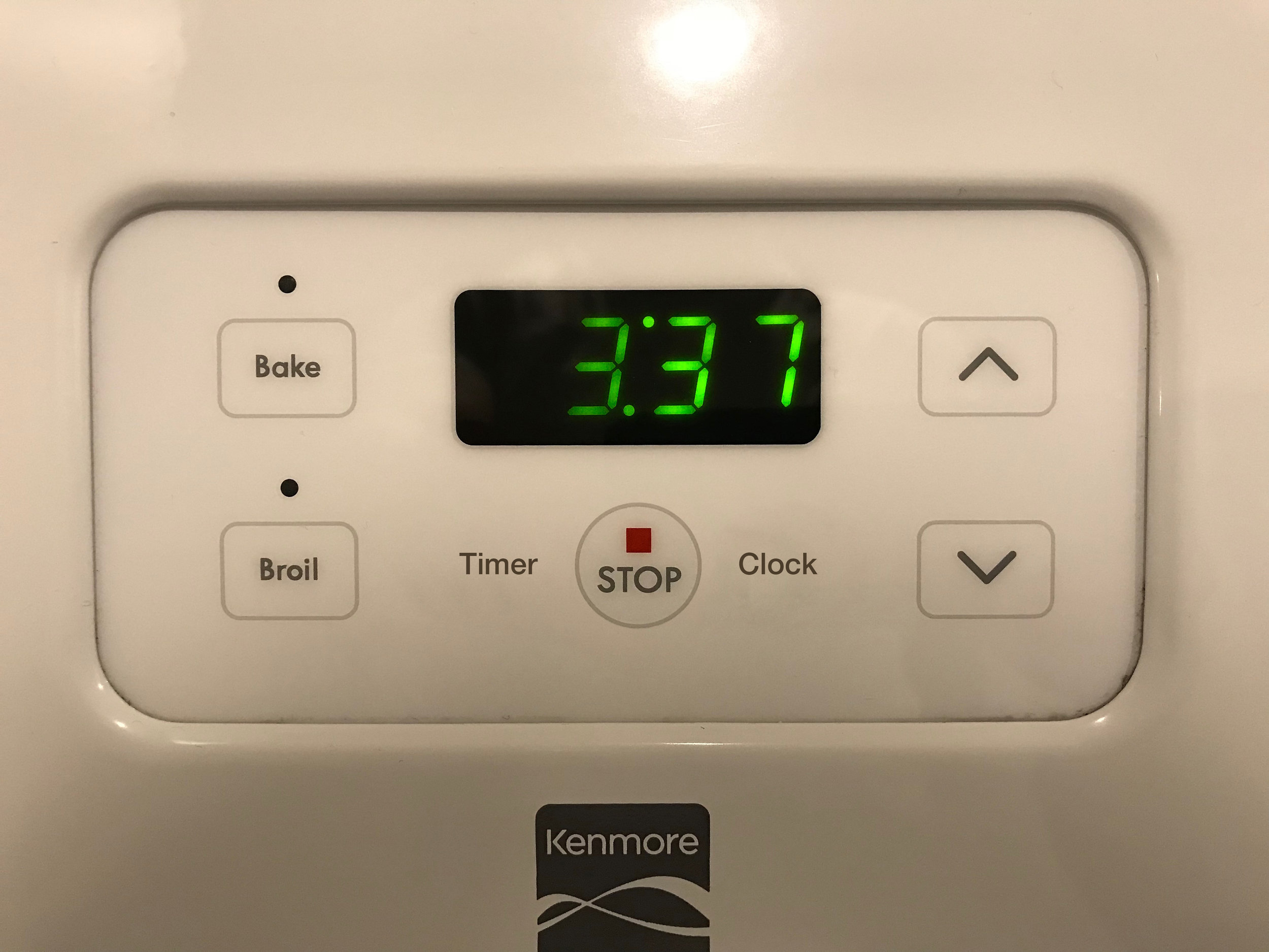
Redesign Step 1: Simplify & Balance
A few problems:
First. There are three very different styles (text, small logo, text and logo in circle) used for three buttons. This is too much variation
Second. The buttons are arranged in the wrong order. The large round button should be placed in the middle with the smaller items balancing it on the side. In their current state they are unbalanced and tilt towards the right.
Third. The buttons take up a space that is too wide. They spill over the width of the clock display above
Forth. The text on the “Timer Set/Off” is overly descriptive and spills over to two lines.
Fifth. The timer/clock logo is confusing. Is it a timer or a clock? Why is it a logo, and the other buttons are text?
Sixth. There is a strange vertical ‘dividing’ line between the Timer and the Clock button. It is unclear exactly why it is there. Did they forget the second vertical line between the Clock and the Stop button? Or should the line been between the Clock and the Stop button - separating the ‘timer’ vs ‘oven’ features? Who knows.
Original
Redesign vs 1
In the redesign, we see
1. Simplification of the buttons to text. Text is often a better option for buttons than graphics.
2. The buttons are now symetric. The large round button is in the middle with the two smaller ones on either side. Symmetry is often better, and in this case necessary (as the entire stove top itself is symmetric - there are two stovetop dials on either side of the oven display)
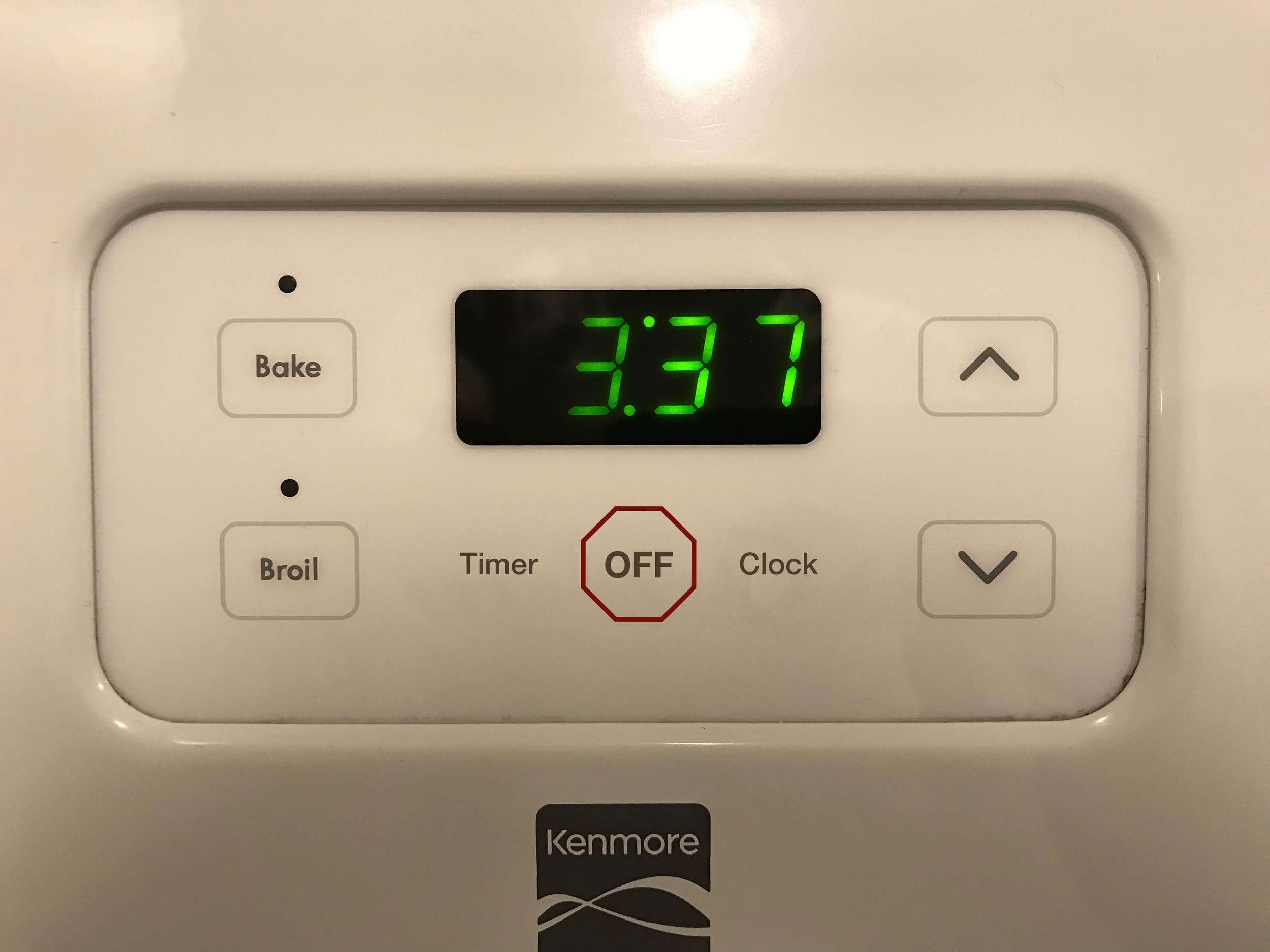
Step 2: Fix the ‘Stop’ Button.
The Stop button is a bit bizarre.
First. Why does the button say ‘Stop’? Does one every say “Did you remember to stop the oven”. The expression is, “turn off the oven”. The button should read “Off”.
Second. It a circle. But there are no other circles on the display. No need to introduce a new design element with no utility.
Third. Inside the circle, there is a small red square and some text. No other button has this combination. It also looks weird.
Forth. The text in the button doesn’t line up properly with the text in the other buttons
Redesign vs 1
Redesign vs 2
In the redesign
1. The text is changed read Off. Because that is what the button does.
2. The circle is removed. It does not fit into anything. It is replaced with a shape that signals ‘stop’ and caution.
3. The red square dot is removed. Instead the outline of the circle is red. This accomplishes the same color/visual cue that Kenmore wanted on this button.
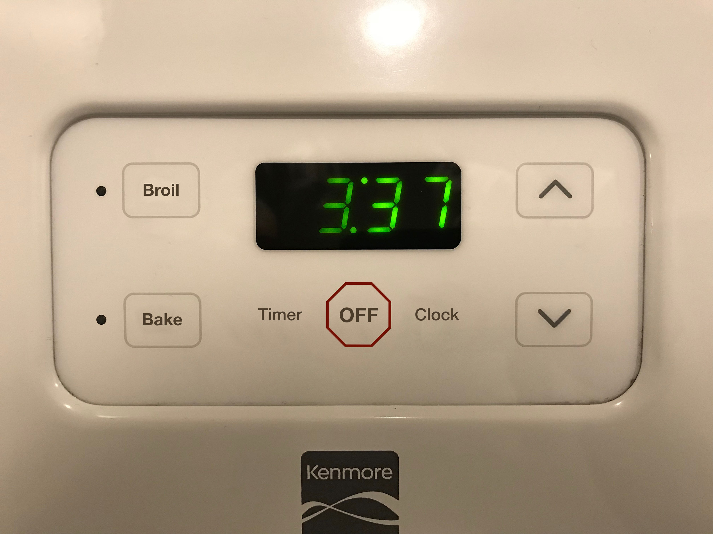
Step 3: The design should mirror the function.
The Broil element is on top. The Bake element is on the button. But Kenmore has placed the buttons in the opposite positions.
Redesign vs 2
Redesign vs 3
Step 4: Straighten the grid
The buttons can be stretched to the natural grid structure they form, with the four buttons in the periphery of the rectangle, and the Clock display lined up just inside the top horizontal line of the rectangle.
The ‘ON’ indicator lights are moved to the left of the buttons so the buttons can be lined up in corners of the rectangle.
Redesign vs 3
Redesign vs 4
Step 5: Center the bloody dial.
Kenmore has failed to install their dial in the middle of the stovetop opening. Either poor attention to detail or poor quality control.
Redesign vs 4
Redesign vs 5
Further Comments
Overall this oven interface still needs work. Probably best to scrap entire layout and start again.
For instance, in order to turn on the oven, one needs to first press the Bake button, then set the temperature, then press the Bake button a second time. If you fail to press the Bake button a second time after setting temperature, it doesn’t start. This is an unneeded step. [1]
[1] Unless of course the need to press the ‘Bake’ button a second time is a safety feature against children from turning on the oven. If so, this makes sense. But, the stove’s design is inconstant, as the stove dials have no safety mechanism on them to prevent them from being turned by children.
Redesign Image Sequence:
