Netherlands: Exemplary Washroom Design
Don't want to read? Watch the video here, or search your podcast app for: Gregory Schmidt.
The first architectural feature one encounters after landing in Amsterdam is the Dutch washroom.
They are designed different from those in North America. This includes
1. Surgical soap dispensers
2. Faucet spouts attached to the wall
3. Integrated lavatory-counter design
4. Micro-sinks & spout-handles
4. Minimalistic design
These comments are also more directed at commercial buildings. Although they are target at the Netherlands, I'm sure these design trends are found in other European countries. The VOLA faucets in the photos below come from Denmark. OPHARDT hygiene's headquarters are in Germany. (They're also make WiFi soap dispensers that transmit usage data to hospital admin). CWS-boco has a history going back to 1899 in Germany and Switzerland with enormous international scale.
Also some confusion around language. When I speak of a lavatory, in North America it refers to a sink or washbasin. This is not to be confused with the British usage referring to a flush toilet.
1. Surgical soap dispensers
I am a big fan of the soap dispensers in the Netherlands. Why? Because they actually work.
1a. Review of typical North American soap dispensers
Lets review how soap dispensers in general in North America work. You either encounter:
(a) motion-sensor dispensers. Which never work. Ever. The sensor is difficult to activate. The timing is always slow or delayed. They typically don't dispense sufficient soap.
(b) manual lavatory rim mounted dispenser. These typically twist in their escutcheon, leak water between the faucet and the lavatory. Frequently they are not filled.
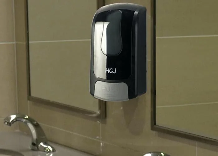
(c) manual wall mounted soap dispensers. These are often cheaply made, and often supplied by the cleaning product distributer. They require quite a lot of hand-device surface contact to activate. Which is undesirable. The wall mounted dispensers generally have a bulky, cheap plastic design.
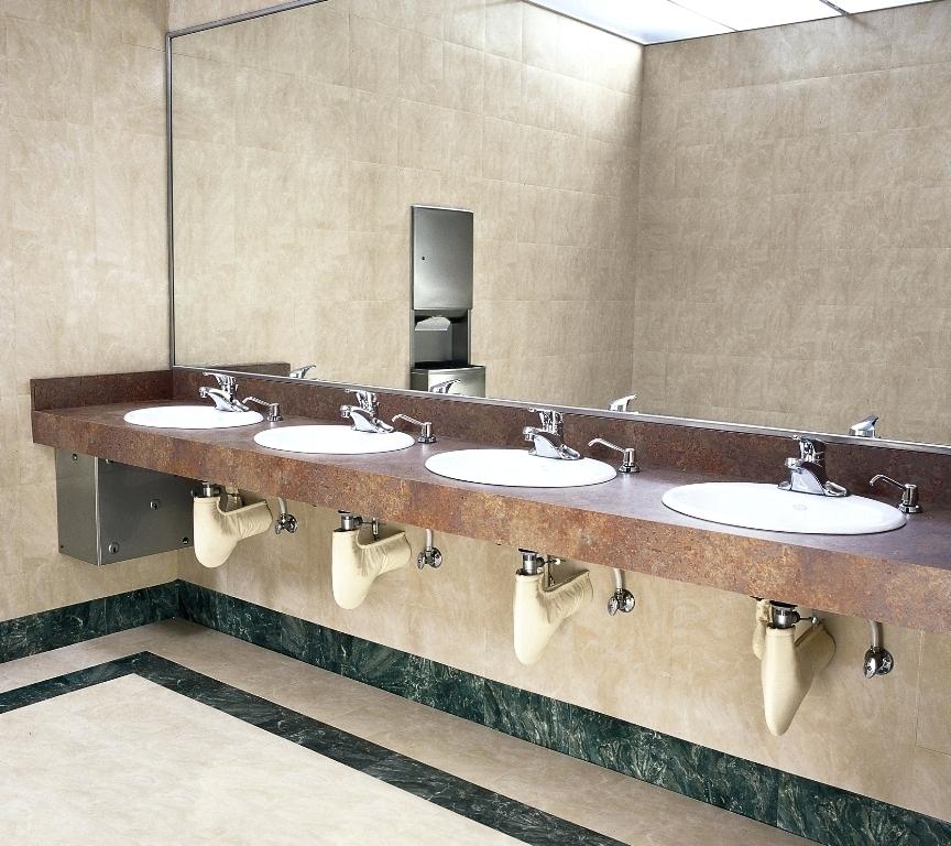
Pictures of American soap dispensers from The Internets
1b. Soap dispensers in Netherlands
They look exactly the the soap dispensors found in surgical scub sinks outside operating rooms. The dispensing handle is a large metal edge that can easily be operated with a forearm or elbow. The device also is vertical (rather than more boxy) and fits between lavatories better.
All the problems listed above with American soap dispensers are eliminated with this design.
These also have a clean modern design. Made of good materials. And easy to clean and refill.
2. Faucets spout attached to the wall
More often than not the faucet spout is attached to the wall. Generally in America the faucet spout is mounted on the lavatory (the sink) or the countertop.
Esthetically, wall mounted faucets looks good. Functionally they are great. Cleaning the sink is easier as faucet spouts and handles are not afixed horizontal surfaces. They are unable to gather water or dirt in the junctions. The absence of faucet escutcheons in the lavatory and countertop also removes removes the risk of water leaking through these holes.
The motion sensor is also mounted to the wall. It works just fine. In fact, it seems to work better than those often found in North America. I'm not sure if it is more powerful (?longer range) than those found inside the sink faucet.
The only downside to wall mounted faucets is that when a renovation or repair is required access to the wall is needed. In those cases where an easily removable panel (from either front or back) has not been built in, major renovation is required.
The normal looking sink on the left is from an art museum. The surgical looking scrub sink on the right was in the microbiology museum.
3. Integrated lavatory-counter design
In many washrooms the lavatory (aka the sink part) was fused as a continuous material with the actual countertop. This eliminates joint lines that can grow mold or leak.
In the case when multiple spouts were in a washroom, the individual lavatory-counters were fused together to create a giant sink. This is my preference for most commercial organizations (high class places aside) as it certainly is easiest to maintain. This design eliminates opportunity for water to pool on the countertop beside the sink basin. If people need a place to put stuff, a ledge can be build onto the wall.
4. Micro-Sinks & Faucet-Knobs
Micro sinks are common outside of North America. Some of the sinks here are so small, that there is only room for the faucet spout escucheon and not also handles. An interesting work around is to put a rotatable knob at the end of the spout to control the fixture.
5. Minimalist design
All items in the washroom had functional and simple design.
Take the toilet bowel cleaner. Or the door nob. Or the toilet seat/attachment. Or the urinal. Have you seen such washroom simplicity? The appliances are simple geometric shapes with surfaces that are completely flat. No excess ornamation in with bevels, or additional design.
I wasn't able to validate in my brief time in the Netherlands if the simplicity of their washrooms leads to increased efficiency or efficacy of the total washroom experience
Photos by GJS. Photos of the lame American sinks come from The Internet.


