UI/UX: Writing X vs Y dimensions
Why this obvious article?
Mobile phones actually write their screen dimensions VERTICAL x HORIZONTAL. Yes, I know, this seems backwards.
This article was investigated to confirm that, yes indeed, in mobile user interface design we write HORIZONTAL x VERTICAL. (Even though the screens that user interface are being displayed on have their dimensions written the opposite way).
Listen to this post on your podcast app under: Gregory Schmidt, or YouTube:
Key Point
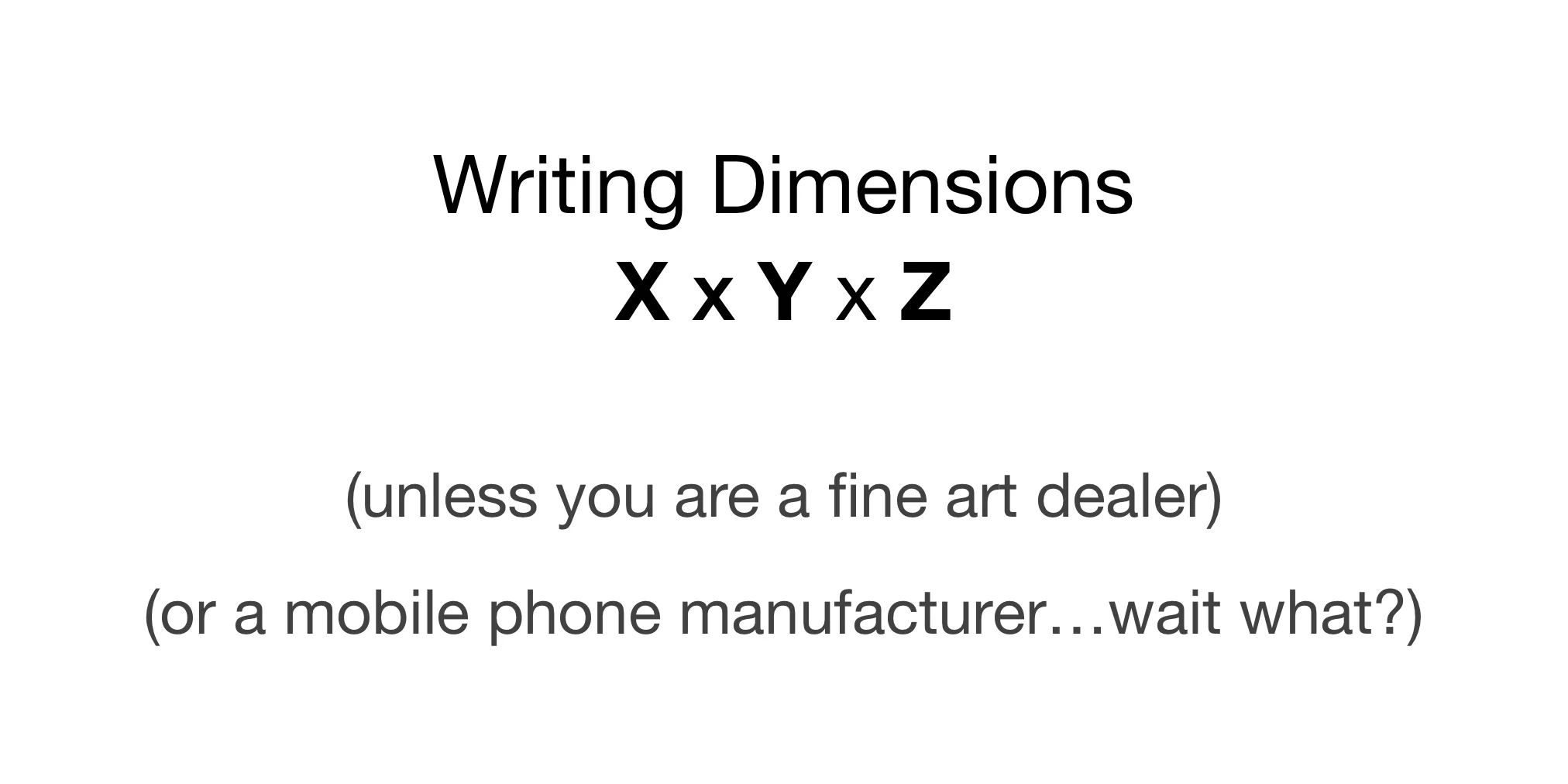
In user interface design, almost always write the HORIZONTAL dimension first, the VERTICAL dimension second, and the DEPTH third.
e.g. horizontal, vertical, depth
x-axis, y-axis, z-axis
width, height, depth
Acceptable dimension notation
X x Y x Z
(eg. 13 x 123)
X, Y, Z,
(eg. 13, 132, 12)
width = 13, height = 123, depth = 12
Unacceptable notations
Never refer to a dimension as “h”.
e.g. 32h
It is unclear if this is “horizontal” or “height”
Do not use a slash to divide dimensions.
eg. 13 / 132 / 12.
This is confusing because slash notation may be used elsewhere for other purposes. Such as to divide different categories of values. Eg. Font Type / Weight / Size.
Why annotate X, Y, Z in user interface design?
1. Its how the software does it
Width x Height x Depth is the standard across for UX design software, as well as how software is coded (x,y,z).
This screenshot from the mainstream UX mockup software Sketch:
2. Width first, height second is used almost everywhere
Graphics industry
Purchasing paper, e.g. 8.5’’x11’’
Science & math, e.g. x,y,z (eg. plot x-axis, æthen y-axis, z-axis)
TV ratios, eg. 16:9, 4:3
The alphabet, e.g. X before Y
Display resolutions, e.g. monitors and TVs (Wikipedia)
Industrial paper: writes the direction of the grain last. This means that if paper was 8 x 24 inches the grain is along the 24 inch direction. This is important so that the paper can be fed into the machine along the grain so that it does not crack. (See Wikipedia).
3. Are there any exceptions?
Yes, mostly around fine art:
Fine art: height x width x depth
Paintings: height, width
Sculptures: height, width, depth
Some publishers and newsprint editors say they used height.
Mobile phones and tablets …. ?
Wait…what? Why are mobile phones and tablets write the dimensions the other way? See next article.
Background
Chicago Manual of Style
1. Accepted notations (note spacing)
8.5 x 11 inches
8.5 x 11 ″
8.5″x11″
2. The x should be in san-serif to look more like a multiplication sign on the letter
3. Use a straight ″ not a curley ”
Listing Dimensions of Your Art Properly, Dec 1 2017, Alyson Stanfield
https://artbizsuccess.com/listing-dimensions-of-your-art-properly/
The comment thread here is great:
https://www.highresolutions.com/what-comes-first-width-or-height/
Fine art dimensions
https://support.boldbrush.com/faso-content-works/list-artwork-dimensions
References "The Artist's Handbook of Materials and Techniques" by Ralph Mayer
https://www.thebalancecareers.com/fine-art-glossary-term-size-1295819


